Catching a Falling Knife
So far in this series, we’ve been looking at long term general market conditions with an overall bullish se...
A look at some of the tools to measure time and price moves.
As you might expect, we get quite a few “how do I…?” questions here at Optuma Towers and we try to update the KnowledgeBase and create Quick Tip videos to help clients find what they need, but this particular query has come up a few times recently.
The question was along the lines of “what’s the best way to count time and price movements on the charts?” Like many things in Optuma, there can be a number of different ways to achieve this, so here are examples of some of the tools available, which can be particularly useful in presentations or reports.
This tool can be used to count price change between two user-defined points (click here for the tool’s KnowledgeBase article). The Price Measure can be set to show the percentage change between the two points, the price change, or both. Along with the usual tool options to change the line colours and style, there is also a Repeat property with an optional expansion factor to help identify potential targets.
In this example, the the weekly chart of gold on the left measures the 2016 move of 329 points - or 31.4% - which is repeated twice more. The chart on the right takes the 186.48 point move and expands each repeated level by the Fibonacci factor of 1.382:
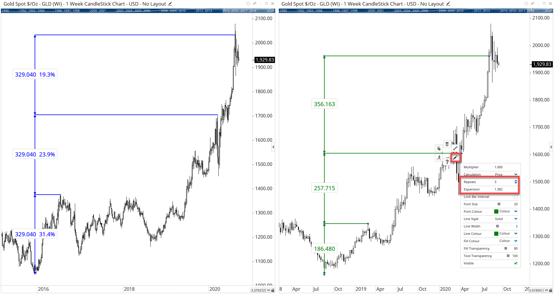 Price Measure
NOTE: you will see the repeated levels on the left-hand chart above are a constant 329.04 points apart, but the percentage moves obviously decrease as the values become higher. To keep the percentage moves constant - and therefore increase the points value - set the expansion factor to the same value as the initial percentage move, i.e. 1.314 in the example.
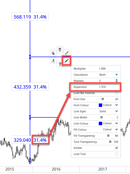 Expansion
This tool can be used to count the distance in time between two user-defined points. The Label option can be set to count the bars (i.e. trading days on a daily chart), calendar days, weeks, etc. In this example the measure between the first two highs in the VIX was 223 trading days, with the major high occurring 448 calendar days after that. As with the Price Measure, the values can be repeated and expanded, which can help identify potential cycles.
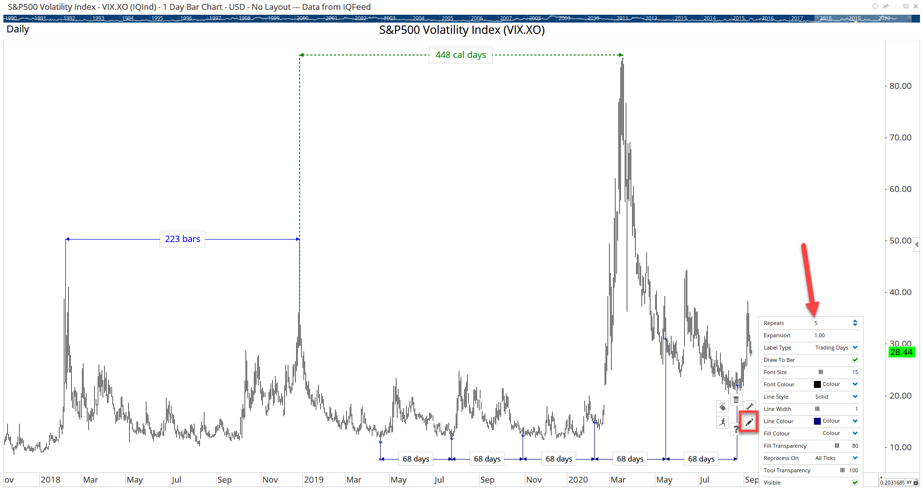 Time Measure
As the name suggests, this is a combination of the two tools, which measures the time and price between two points. The tool includes a number of labels which can be turned on or off, including the dates, prices, and Range %. This tool has the added flexibility to create your own measure, such as (P1+P2)/2 to show the midpoint of the two selected prices:
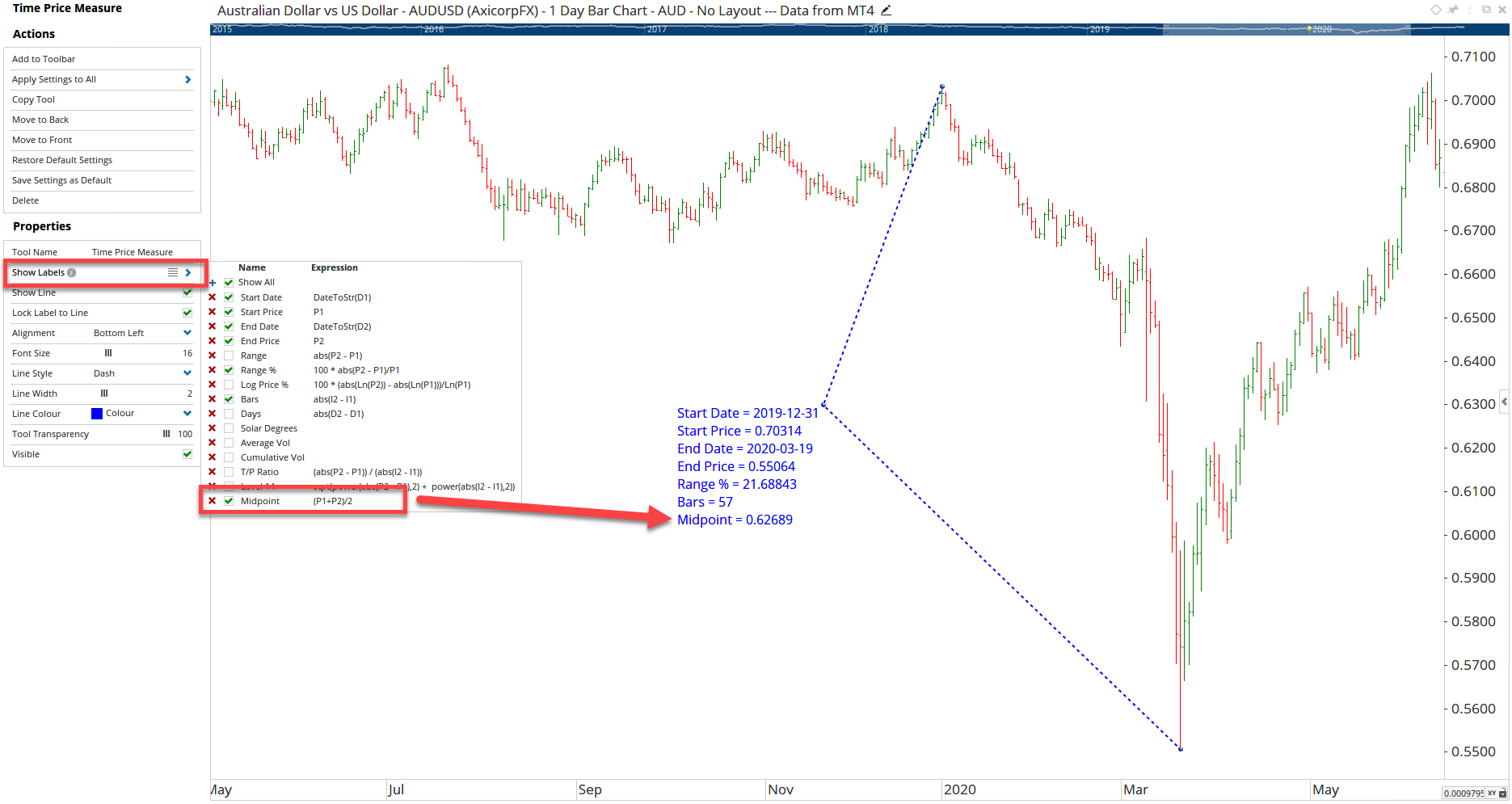 Time Price Measure
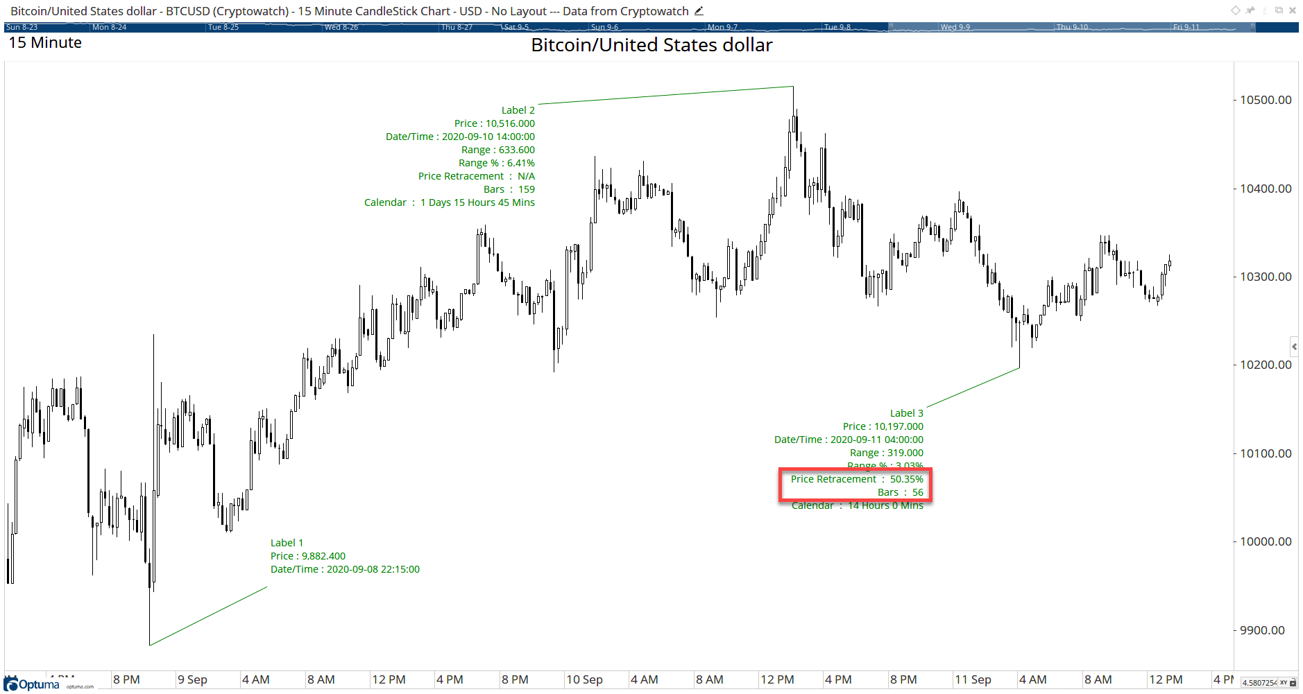
The previous tools all measure between two points, but what if you wanted to measure more? You could apply the tools multiple times, or you could use the Time Price Label tool (TPL). This allows you to apply an anchor label, and then by selecting the Add New Label option under the tool’s Actions you can add multiple labels, each one counting from the previous.
Note: when applying three or more labels the tool can calculate retracement measures of the previous label range.
In this example on a 15 minute chart of Bitcoin, the 6.4% move up from the anchor point at Label 1 to the high at Label 2 took 159 bars (or 1 day, 15 hours and 45 mins), and then 56 bars to retrace 50% of the range.
 Time Price Labels
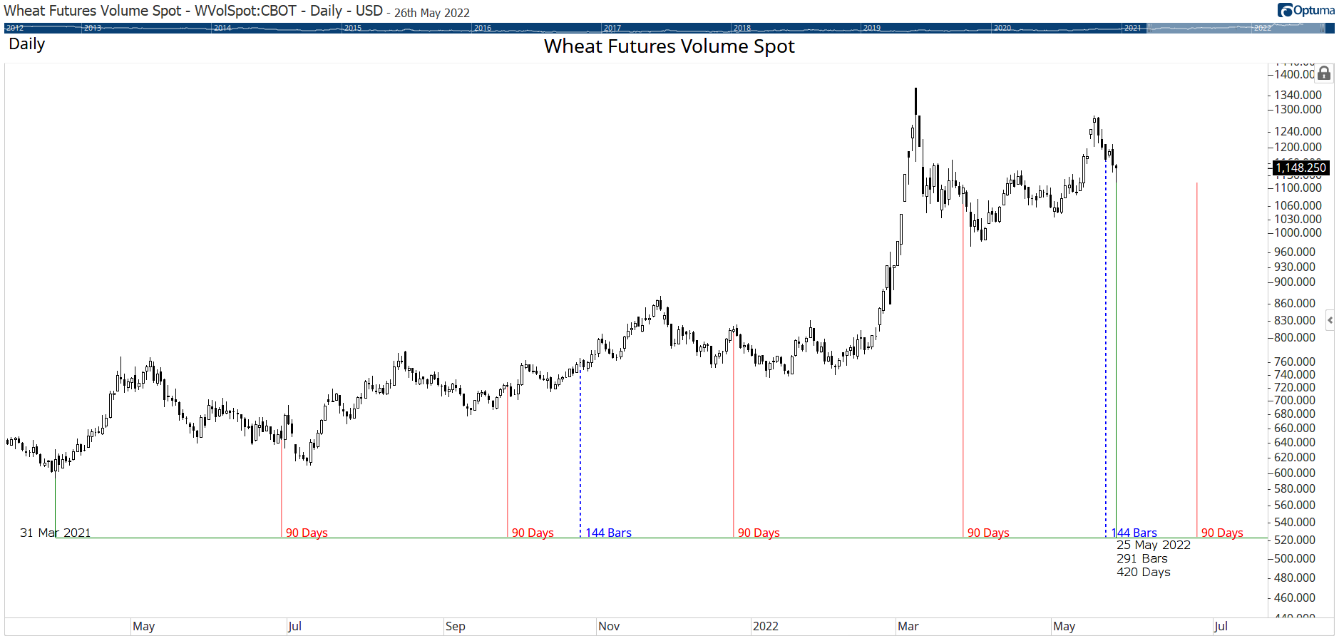
Clients with the Gann tool module can use this tool which counts bars, days, weeks, etc from a user-defined starting point to the latest bar. As new data is added to the chart the count increases, and it’s possible to set specific counts to be marked on the chart, such as every 90 calendar days, or 144 trading days as seen in the chart of wheat below. Starting at the low on March 31st 2021, the red lines show every 90 calendar days, with the last blue line showing the second 144 day cycle occurred just a few days ago as at the time of writing we are 291 trading days - or 420 calendar days - from the starting point.
 Gann Day Count
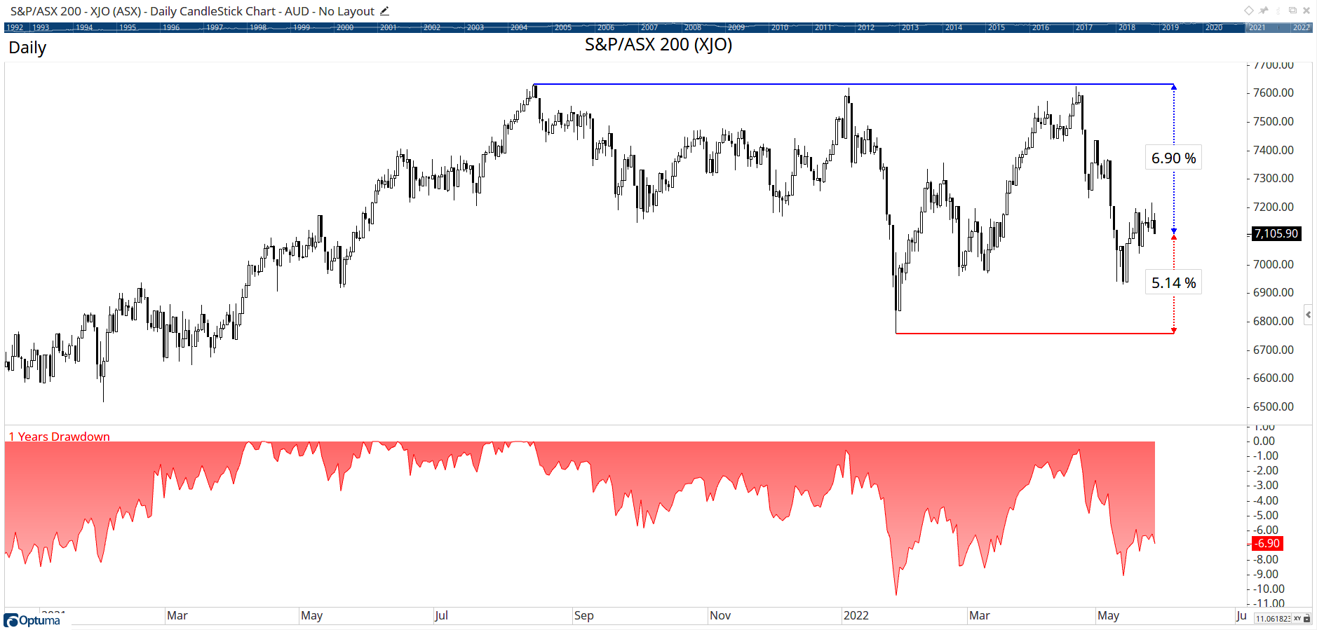
The Range From Extremes automatically calculates how far the current price is from the highest high or lowest low over a user-defined period. Like the Gann Day Count tool, the values will automatically update as new data is added to the chart. This range can be expressed in either percentage, standard deviations, or Average True Range values.
Here we see the RFE tool for the ASX200 index ($XJO), which shows it has been in a fairly narrow range over the last year: just 5.1% above the one year low and 6.9% below the high. The plot below the chart is the Drawdown tool which calculates each day’s low price from the 1 year high.
 Range From Extremes
These are just a few examples of some of the tools we have to help with analysis - and don’t forget that with the scripting language you can create your own tools, such as the 50% level of the all time high. If there are any other types of tools that you would like to learn about, let us know or post in the client forum.
Get blog updates and Optuma News
