ASX and S&P500 Sector Workbooks
This week saw the quarterly rebalancing in the ASX200 and S&P500 indices. Optuma clients can download and o...
A quantitative look at what happens when the S&P500 index sets new all-time highs.
The S&P500 index ($SPX) in the US set a new all-time closing high today - the first since the end of August. I remember reading comments in the financial (and social) media since those last highs that the market is overbought and due for a pullback, especially as we’re now in the longest bull run in history - although that is hotly debated, and possibly the subject of another post.
Following the new high on August 29th investors did seem nervous. In fact the index proceeded to register lower highs and lows for six consecutive days (the first time since May 2012) - but it’s important to remember that it stayed within 2% of that high of the 29th before recovering. So are those commentators correct? Is there any justification that they should feel that a downturn is imminent just because a new high is recorded - especially given that an even higher high is now in place?
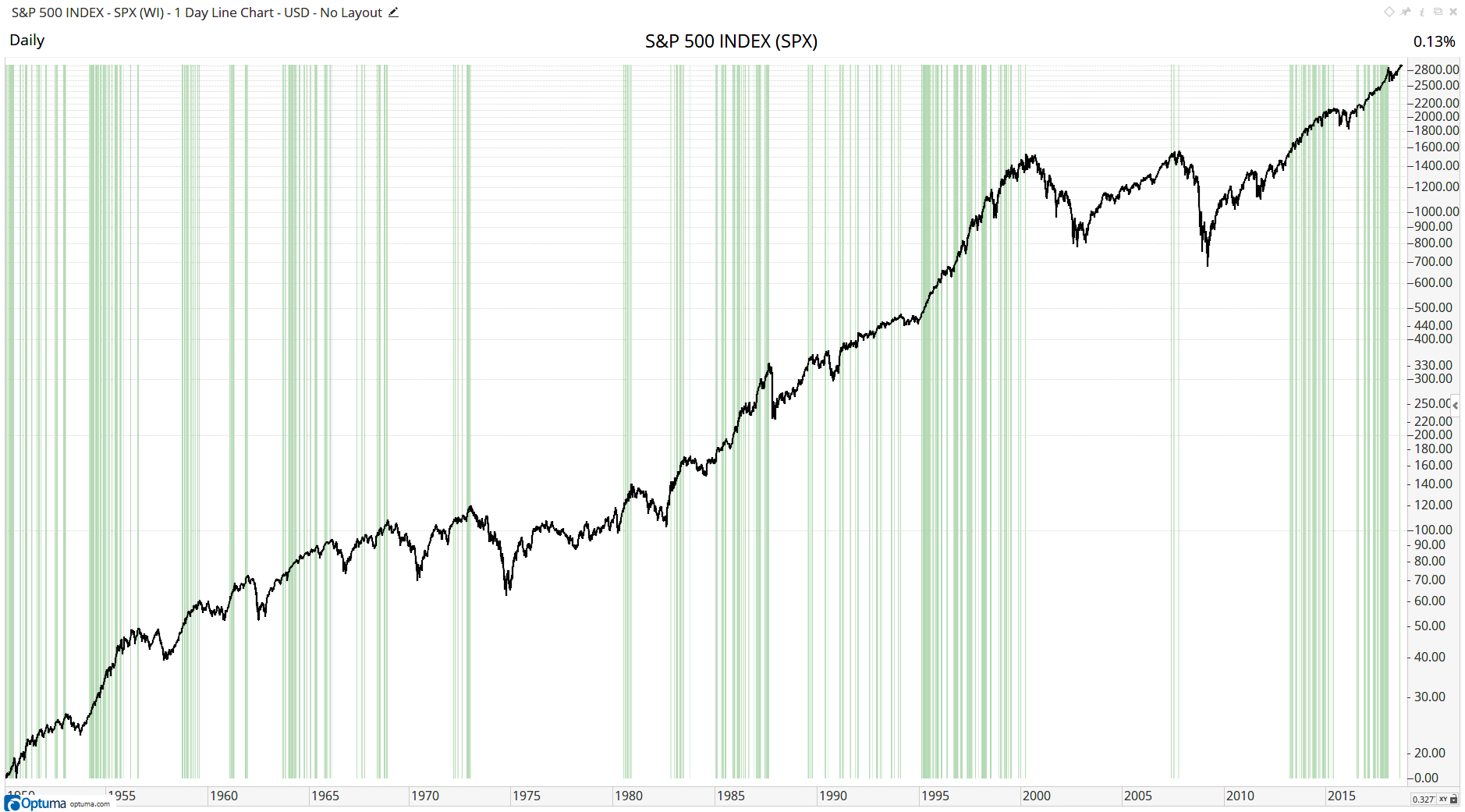
Let’s take a look at a long-term chart of the S&P500 index and highlight every new closing high. The easiest way to see them is by using the Show Bar tool set to display as a line. This tool highlights any true/false event on the chart, in this case using the HIGHESTHIGH() function to show when the close is higher than any previous close in the last 50 years:
CLOSE() >= HIGHESTHIGH(CLOSE(), BACKTYPE=Years, BARS=50) Custom Show Bar Tool
As you can see, the green vertical lines are usually grouped together indicating that new highs are often followed by more new highs, ie once the market has momentum it tends to keep going. However, occasionally they have occurred just before a correction, such as in 1968, 1972, 1987 and more recently in 2007.
This is all interesting from an academic point of view, but how do we know what to do when we are getting a new high and the media starts calling for a pullback? This is where we have to cut through all the noise and look at the statistics to see what has happened previously. We can do that with Optuma’s Signal Tester.
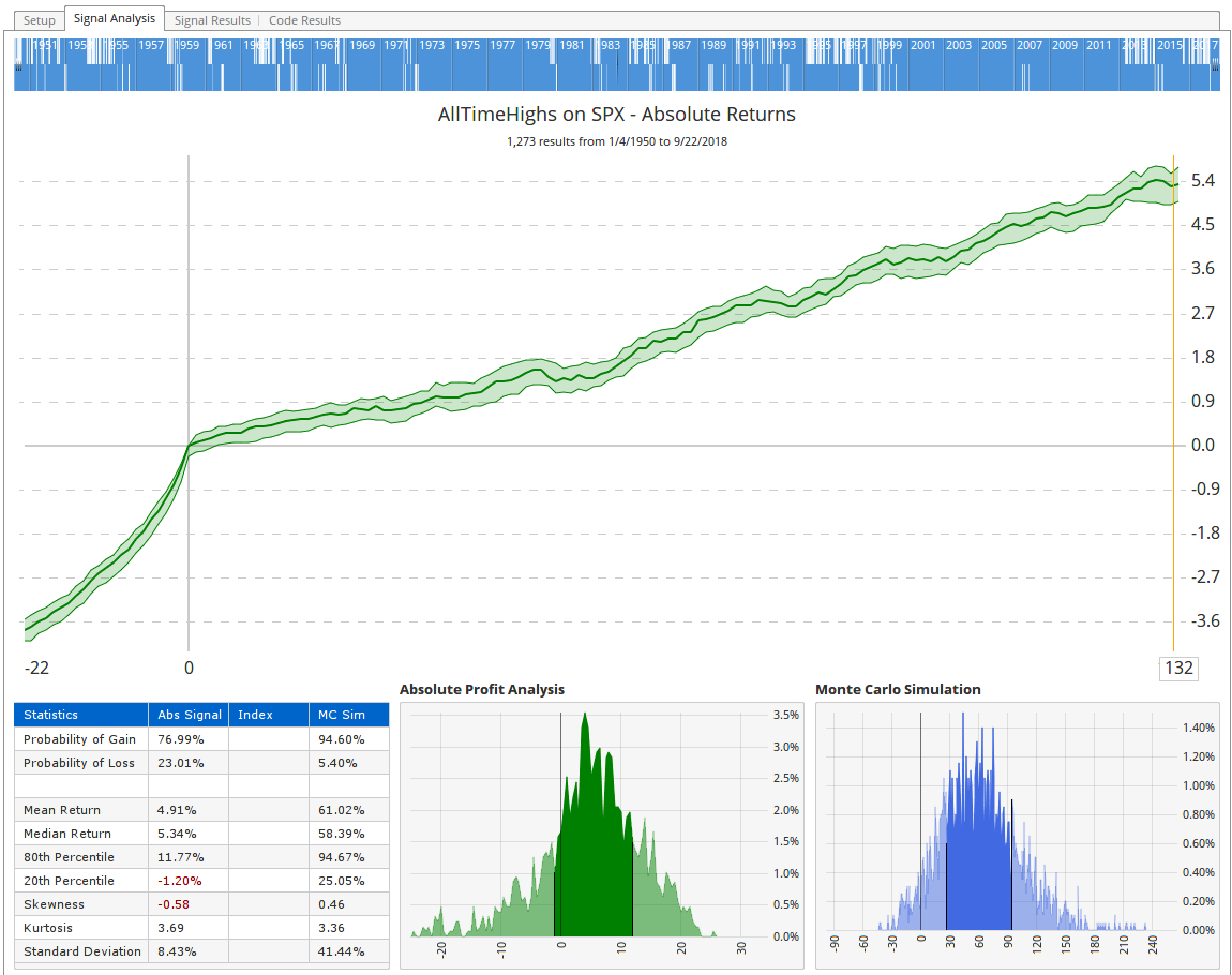
By using the same script formula as the Show Bar above, the Signal Tester takes an entry every time there is a new all-time high (so at every vertical green line in the image above) and calculates the average return after every signal, plotting the returns over time. Today’s high was the 1,274th new all-time high using data since 1950 (ie not including the historical hypothetical data calculated before the index existed). The Signal Test results tell us that the mean return of the previous 1,273 new highs was 4.9% six months - approximately 132 trading days - after each signal, with a probability of gain of 77%. In other words, you would expect three wins for every loss if you took an entry on every new high and would gain, on average, almost 5% six months later.
 Signal Analysis
If you look at the left of the chart above the -22 represents 22 days before each signal (about a month of trading). The steep incline leading up to Day 0 (ie each entry) illustrates the strong momentum going in to each new high.
Of course, this doesn’t mean that the index will be 5% higher in 6 months’ time, but history tells us that new highs are certainly nothing to be scared of.
Get blog updates and Optuma News
