ASX and S&P500 Sector Workbooks
This week saw the quarterly rebalancing in the ASX200 and S&P500 indices. Optuma clients can download and o...
Introducing the GoNoGo indicators: eliminate analysis paralysis to keep your focus on price, without losing sight of the complete technical picture.
“We are what we repeatedly do”
Aristotle.
As a trader or investor, it is essential to develop a process. Using the same checklist or rules by which you determine position entry and exit creates a repeatable discipline for trading that helps avoid behavioural pitfalls. Technical Analysis provides a broad toolkit of indicators that, when used in combination, give the trader a weight of the evidence perspective that can be used across timeframes and in any market regime. While the composite blend of information is powerful, the complexity of a price chart can lead to Analysis Paralysis.
As a metaphor for portfolio management, imagine you are a young person learning to drive. Safety (risk management) and efficiency (profitability) require that you master many different functions of the vehicle and be able to interpret in real time the many challenges that await you on the roadways (markets). Driving can be fun, but involves inherent risk, and the many functions of the car can be overwhelming. As a young adult you learn that every single time you get into your vehicle it is not only sensible but potentially lifesaving to follow a “new driver checklist”. It could look like this:
And, while driving there is a myriad of information to process and react to in real-time, speed, distance from other cars, navigation, fuel levels, gear shifting, etc… The disciplined approach to driving makes one a more responsible and importantly, a safer driver. We all have a checklist to follow even though it may be largely subconscious for experienced drivers. The same approach applies to using technical analysis for investing in markets. A disciplined process that applies the same checklist to every trade ensures we don’t make irrational decisions based on our own fear or greed. A diversified blend of technical indicators adds probabilistic rigour to identifying trends and their reversals. As investors, we seek to participate in the majority of a security’s price move while avoiding the hazards of the financial markets. We seek an intelligent framework in which to invest; one where we can make fast, effective decisions based on objective information. A technical analysis checklist might include the use of:
Sophisticated traders and portfolio managers develop their individual technical checklist over time. They have faith in their process and adhere to the rules to therefore remove uncertainty in the decision-making process for each and every trade. This allows an investor to take deliberate action rather than succumb to the emotional reactions we have to the daily barrage of storytelling and misinformation in headline news. To extend the driving metaphor into the highest arena of skill and danger think of a Formula One race. While it might be helpful for a driver to understand the physics of internal combustion engines or fluid dynamics, it is not necessary for his ability to pilot the car around the racetrack. One of the incredible advantages of technical analysis is that you can understand the price action of any security over any timeframe without a deep understanding of the fundamentals of that particular industry, intimate knowledge of corporate actions, the private politics of management teams, or expertise in emerging technologies. As market participants we need to pilot our investments around the racetrack. In this way, by sticking to a rules-based process which follows a sensible set of guidelines, we can remove subjectivity or uncertainty and be able to invest in any area of the market.
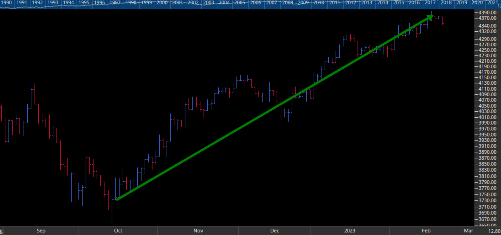
To demonstrate this idea, let’s build a sensible checklist of technical tools. Identifying a trend is arguably the most important concept in technical analysis. Investors who can successfully identify market trends can profit from the majority of the move. Nicolas Darvas exclaimed, “Buy high and sell higher.” This is a simple concept, but not easy to execute. A checklist, a disciplined process is required to allow for confident recognition of a price trend as early as possible. How might an analyst do this? The following is an example of a responsible (yet rudimentary) checklist of trend identification using current price data from the FTSE All Share Index, $ASX as our example. Let’s start with the very basics. Can you visually identify a trend? Are you seeing higher highs and higher lows, the definition of a trend? In other words, are you seeing prices move in a discernible direction? For an uptrend, you will be looking for price to be moving from bottom left to top right. Consider Figure #1 below.
 Figure #1 – FTSE all share index, $ASX daily bar chart: “higher highs and higher lows”
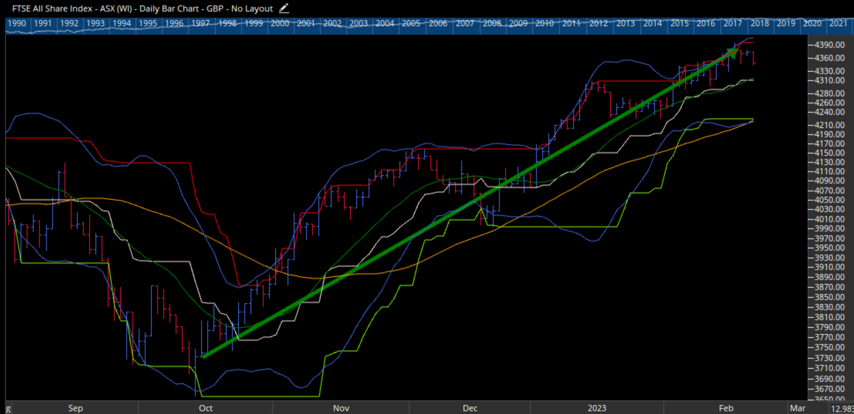
At this point, it would make sense for the analyst to automate the identification of highs and lows, to remove subjectivity. A technical indicator such as Donchian Channels may be used for this. This study compares current price to the highs and lows of price action over a defined period. For example, if the current price is the 20-period high, then the upper line of the channel (red) will move up with price. An equivalent formula is used to identify higher lows (green) This way, you can see the price trend plotted via channels on the chart. So prevalent is the use of simple moving averages on financial charts, the joke among technicians is that the simple moving average doesn’t even count as technical analysis.
Many portfolio managers who condemn technical analysis still insist on having a moving average on every chart! Comparing price to its historical average gives us vital information. It is inherently bullish when a security is trading above its moving average. Securities trading higher than they have in the past reflects the market’s perceived value for that security. Next, you could add Bollinger Bands to identify breakouts.
A faint memory from a distant mathematics class may remind you that 95% of all data points in a set of normally distributed data will fall within two standard deviations of the mean. Bollinger Bands work off that principle, bands formed two standard deviations away from a mean tells us to pay attention to any data that falls outside of those two standard deviations. Typically, the mean used in Bollinger Bands is the 20-period moving average. Therefore, if price is breaking out of the bounds of a Bollinger Band, something important is happening. When the bands are narrow, volatility is compressed. The start of a new trend can often be identified in the direction of the break. Figure #2 below shows these three indicators overlaid on our chart of the FTSE All Share Index, $ASX
 Figure #2 – FTS all share index, $ASX daily bar chart: Donchian Channels with a 50-day simple moving average and Bollinger Bands
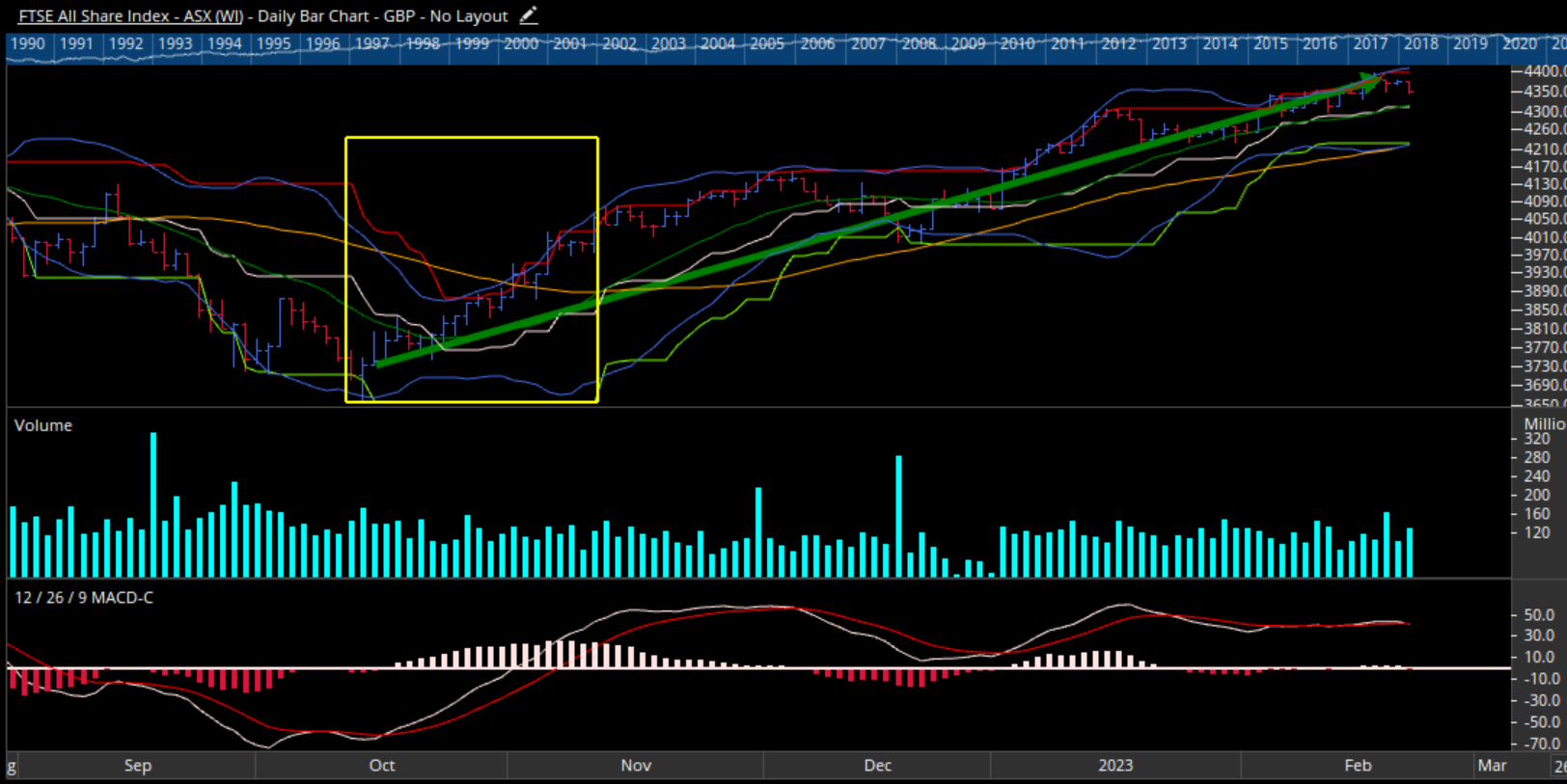
Our analysis is not complete. To get a sense of market participation, one might add volume to the chart. Volume is the original confirmatory indicator, one used by the founder of western technical analysis Charles H Dow. Volume can provide confirmation when looking at price action. Significant price action when volume is heavier than usual informs our understanding of the strength of the price move. For example, a trader may want to see market enthusiasm (heavy volume) on a price breakout. To keep this example simple let’s add just one more indicator to our chart: the Moving Average Convergence Divergence (MACD) indicator. This study is often thought of as a blend of trend and momentum ideas. The MACD looks at the difference between two exponential moving averages. This gives the user a sense of how short-term prices are moving relative to longer-term prices. Then a further exponential average is used to smooth MACD and give a signal line. Traditionally, when the MACD line crosses above its signal that is a bullish sign because the short-term average of price is crossing above the longer-term average.
 Figure #3 – FTSE all share index, $ASX daily bar chart: Donchian Channels with Bollinger Bands, 50-day Simple Moving Average, Volume Histogram, and MACD – Interpreting start of uptrend
At this stage we may pause, take a step back and try to make sense of the chart we have built. Assessing all the information we have added to the chart of $ASX we will ask ourselves at what point on this chart can we be confident that we are able to identify the beginnings of a new trend upwards?
Note the area inside the yellow rectangle in figure #3. Somewhere during this timeframe, we see all of our trend identification criteria being met. MACD first crosses above its signal. A few bars later price breaks out of the upper Bollinger Band. That is followed by the red Donchian upper channel line moving higher indicating a new 20-period high in price. Several bars later, price climbs above its moving average. Finally, volume rises as the market shows enthusiasm for the strength of the price move.
We are now faced with a problem… As the checklist grows and the number of valid technical concepts are added we can overwhelm our own analysis and make it difficult to see price action itself. Using this relatively simple checklist can introduce uncertainty. How many elements of our checklist must be present in order to enter the trade? What if we are fighting against an otherwise bearish thesis, could we find evidence to argue staying out of the trade? Analysis paralysis creeps into our process and we fall prey to our behavioural biases.
Many professionals will have a much more complex process than the one we outlined above and will use many more indicators than represented here. This introduces redundancy or even conflicting signals. With enough lines on the chart, the human mind can convince itself of almost anything. Too many components on the chart can obscure price action – our most important indicator of all! Rather than arriving at a sensible conclusion quickly that moves the analyst to act, we are left with more questions and uncertainty.
Our challenge is to retain all the information from our trend identification checklist yet remove the complexity of the data displayed on our chart. We want to separate signals from noise to gain a clear picture of trend while keeping the focus on price.
GoNoGo Trend® blends all the foundational studies used by industry professionals into an indicator that colour codes the price bar based on the strength of trend. Handling all the complex technical analysis and computing the heavy mathematics in the background, we arrive at a chart that uses a weight of the evidence approach to show trend direction and intensity.
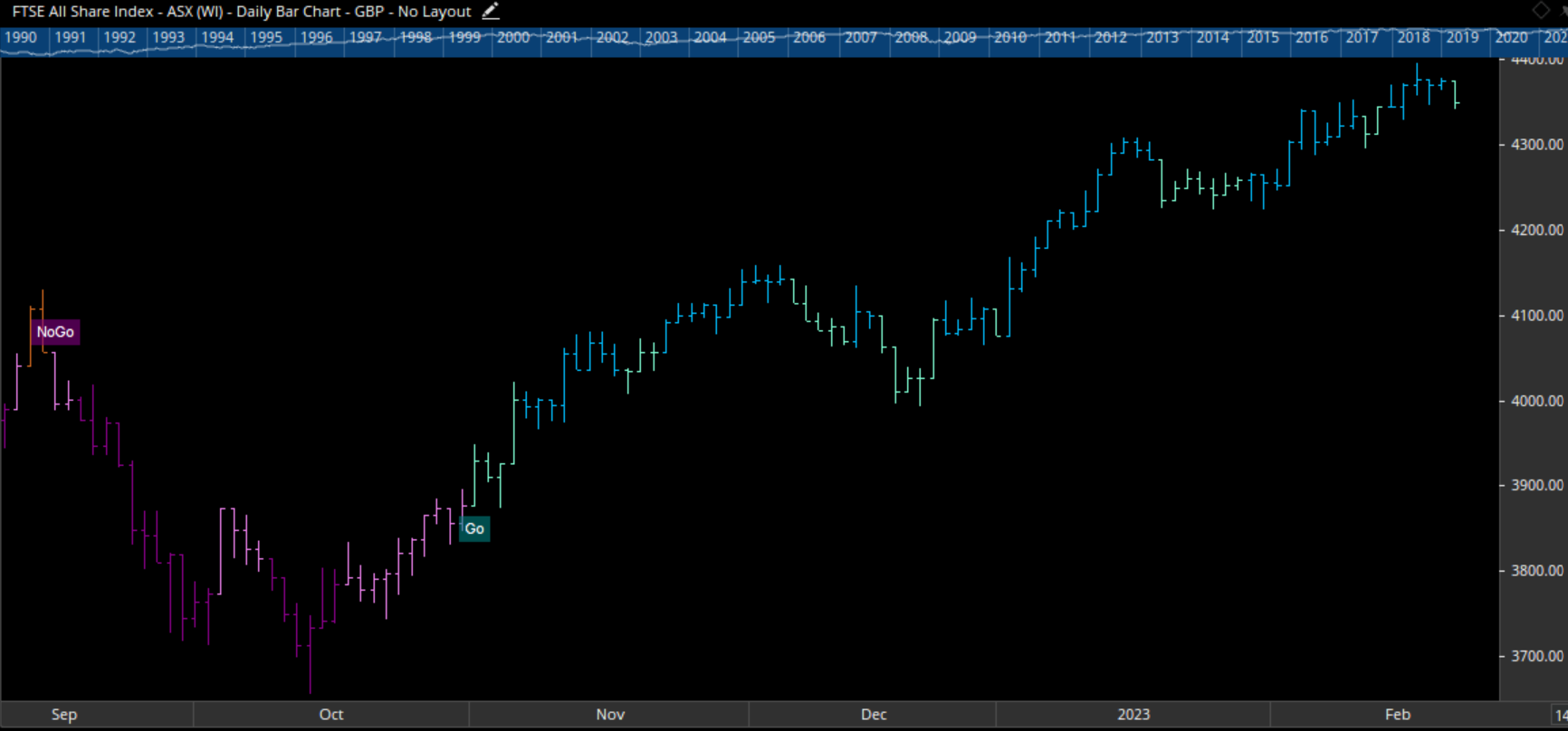
Borrowing terminology from a NASA shuttle launch, we divide trend direction into “Go” or “NoGo” giving us a simple pass/fail test for long positions. Building sensitivity into the study, we provide both a weak and strong form colour for both “Go” and “NoGo” trends. Strong blue bars indicate the most bullish trend conditions. Paler aqua bars represent a weaker form of a “Go” trend. A strong “NoGo” trend is painted with purple bars and a weaker “NoGo” trend is displayed with pink bars.
A “NoGo” trend tells us that we are in a bearish technical environment. The checklist has been broken, helping us objectively exit long positions and potentially evaluate short positions in the same security. Amber bars indicate neutral readings on the composite of trend indicators and are named “Go Fish” bars. Jesse Livermore is famously quoted as saying “in markets, there is a time to go long, a time to go short and a time to go fishing”. When we do not have enough criteria being met for trend direction, GoNoGo Trend tells us to “Go Fish” and paints the bar amber.
Figure #4 represents the same $ASX chart with the GoNoGo Trend indicator applied. You can see where the new upward trend is identified with the “Go” flag. We can compare this with the vague area of trend identification in the Figure #3. The government wouldn’t launch billions of dollars of hardware into space unless the conditions were a “Go”. The decision to launch an investment should be just as clear.
 Figure #4 – FTSE all share index, $ASX daily GgoNoGo chart
For more information about GoNoGo Charts, visit www.gonogocharts.com
To celebrate the release of the GoNoGo add-on in Optuma, for one week only you can save 30% off the usual subscription price of US$125 per month (or US$1,500 per year). With this discount, you will only pay US$87.50 for the first month’s subscription (or US$1,050 for up to a year).
Get blog updates and Optuma News
