Catching a Falling Knife
So far in this series, we’ve been looking at long term general market conditions with an overall bullish se...
Correlations are an important tool in portfolio construction. But are you aware of the dangers that nearly every analyst ignores? In this post we will review what correlations are, how it can be used to diversify risk and what the dangers are that you have to be aware of.
In the CMT courses we teach on the correlation between different securities. The reason is that when we are constructing a portfolio, we don’t want to invest in too many securities that have high correlation —unless they all go straight up of course—then we’ll take ‘em all! The reality is we cannot know that in advance and the prudent thing to do is to have diversification in our portfolio to minimize risk. The way we do this is to look for uncorrelated securities. In plain english, we look for securities that will not all fall and rise together.
This is a really clever way to manage risk, but there are some dangers with correlations that I want to explain. One of these I was not even aware of until I started writing this post.
Let’s first take a step back and explain correlation. If you’re a stats geek, you can skip this part.
Here’s the interpretation as plainly as I can state it. “Correlation is a value that describes the linear relationship between two variables”. Now let’s break that down.
We can see in the first image below that SPX and DJI move in almost complete unison because a change in one seems to always have the same proportional change in the other. (NOTE: The slope of the line is “Beta” a beta of 1 would be the same percentage change. “High Beta” are values greater than 1 and means that for a 1% change in SPX, there is a bigger change in that stock).
In the second image, the XJO and DJI still have a positive relationship, but the spread of the points shows us the relationship is not as strong. In the final image we show the relationship between the US$ (DXY) and the DJI. The relationship is slightly negative and there is a wide dispersion around the line.
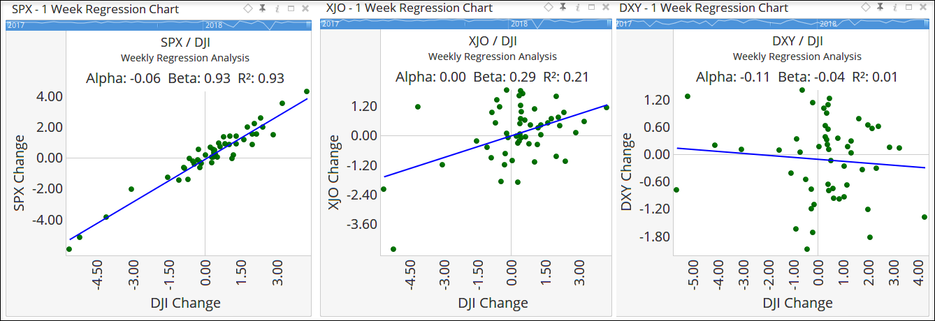 Weekly Regression Charts
The important thing right now is to understand that Correlation tells us how closely related these two data sets are.
Ok, now that we have dealt with that, let’s look at how we actually present Correlations. Below is a Correlation Chart from Optuma. Every security we add gets posted on the rows and columns. To find the correlation value between two securities, you simply find the intersection point and read the value.
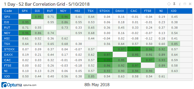 Correlation Grid
I know these are all Indices and you may not be adding these to a portfolio, but they are suitable for the purpose of illustration.
If you were holding HSI and you wanted to diversify, you would search along the HSI row and find the indice with the lowest correlation value. That would be the one that is closest to 0, which in this case would be DAXX. Remember that it is closest to 0, not the lowest number.
There are a number of things that jump out at me when I look at this chart:
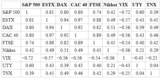 Market Correlations by Markos Katsanos
That chart is a weekly grid made up from 52-weeks of data. To compare, I need to update my chart to be the same time-frame (see below).
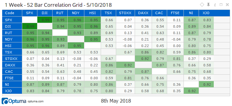 Correlation Grid
There are a few different securities in there but for the pairs that overlap, you can see that the values are nothing alike. This did not make sense to me as we had always talked about correlations as constants. If they were there, they were there always. There are many texts/articles that talk about market correlations as absolutes, and this is telling me that that is not the case.
This led me to look for historical values of correlation. I could open up a Script Chart, add the same securities and set the script to reveal to me the weekly correlation to the SPX. Here is that chart:
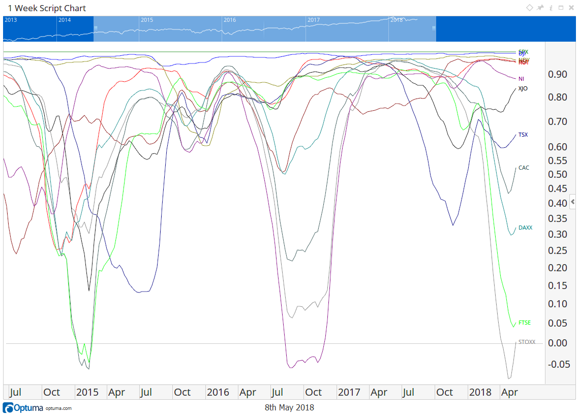 Correlation Grid Script Chart
Immediately you can see that the correlation is not consistent, there is an oscillation that is happening. Correlations are in no way constant over time. This is only the last five years, but these oscillations seem to go on for many years. In fact, in 1995 Japan’s Nikkei was at -0.90 correlation. Even the Dow and the SPX deviate slightly. Note: there is a currency component to this that needs to be considered - I’ll save that for another post.
The only time that all indices are correlated are in times of major bear markets. Then everything is correlated to 1! You can see the 2007-2009 period near the start of this longer-term chart here.
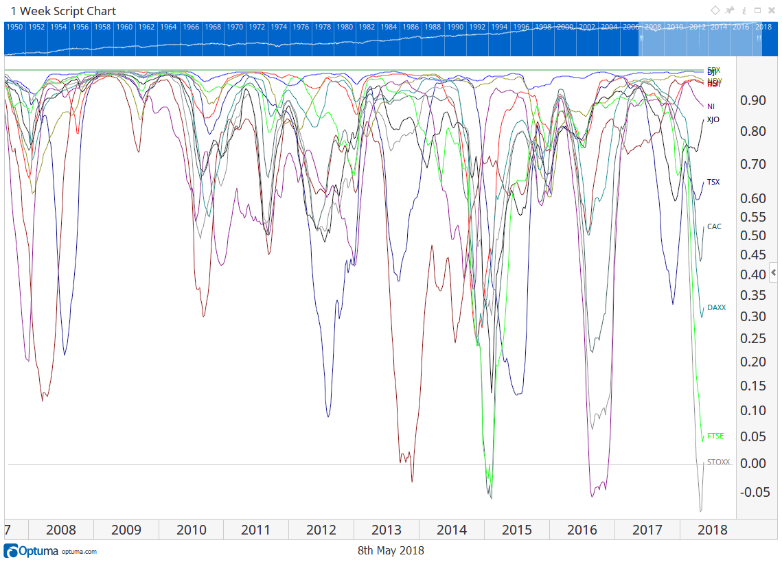 All Indices Correlated
Bottom line is that correlations are not static, we can clearly see there is a cycling in correlations. We could try some Fourier analysis on the cycles, but I’ll save that for the next post as well!
For now, what are the correlation dangers that we have discovered? These are the four things that you need to be aware of if you are using correlations:
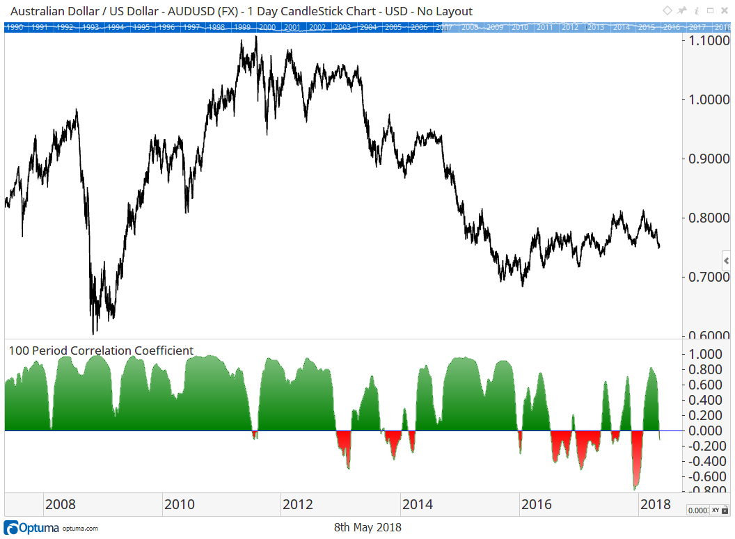 Cycle Between Being Highly Correlated and No Correlation
Correlations are a powerful technique that we can use, but as with everything, we need to be sure that we understand what it is that we are working with and what the limitations are. Nothing is 100% perfect 100% of the time.
Of course adding too many uncorrelated securities to a portfolio can also have the effect of diversifying away all risk and, by extension, the opportunity for gain. Our rewards are compensation for the risk we bear.
Get blog updates and Optuma News
