GoNoGo Trend Identification - Part 1
Overcome 'analysis paralysis' by using GoNoGo indicators in Optuma
The DVAN SmartLines module for Optuma is a suite of market tools that gives an investor access to Divergence Analysis’ 27-year moneyflow methodology.
The DVAN SmartLines module for Optuma is a suite of market tools that gives an investor access to Divergence Analysis’ 27-year moneyflow methodology. The module is comprised of indicators that create a clear framework in which to analyze markets—including trading signals, trend direction, momentum, support/resistance, and buying/selling cycles. I’m pleased to announce that these tools are now available on Optuma. Contact support@optuma.com to have a free trial enabled on your account, or click here to subscribe.
Let me tell you a bit about how these tools were developed. The year was 1985, and after studying technical analysis for over 10 years, reading everything I could get my hands on, I considered myself adept at this type of analysis. I was a broker working at Alex Brown & Sons Inc., where I continued to see the lag effect from technical analysis techniques, and wanted something better.
I began by writing out in two paragraphs what I wanted to accomplish. In short, I wanted to develop a systematic approach to market entries/exits. But these had to be “leading indicators”, as opposed to the 99% of technical indicators of the day that all lagged. They lagged because the inputs were prices—something had to occur by price and it would show up in the indicator afterwards.
I had worked at using raw volume data on two previous occasions, but it was just too volatile to use. I had to develop some math to “calm” this data so it could be used in analysis. Working on my own (mostly in the small hours of the night) I began developing an algorithm that would incorporate raw volume data. My tools were a pencil, a calculator, and many ledger books (the kind accountants used to use). I would work on the algorithm and then apply it by hand, getting data from the Wall Street Journals stacked up in my office at home. Then I would graph the results (yes, on graph paper!) and see how it looked relative to the price graph of the S&P.
Time and time again I would tear up the graph and return to my calculator, working on the algorithm. It wasn’t until I totally eliminated price from the input and the algorithm that I began to see on the graphs what I had been searching for. A leading indicator was emerging that would basically mirror price behavior—except at tops and bottoms. This is where it would diverge from price behavior, and these divergences marked the turning points by prices.
I had succeeded in what I set out to do. The development of this, and several other indicators, using like techniques and methodologies took me from 1985 to 1987. I left my position at Alex Brown & Sons in 1989 and started Divergence Analysis Inc. In the early days we made our reputation by calling tops and bottoms. I learned a lot under fire working with heads of some top hedge funds of the day. I say “under fire” because there was no such thing as a “maybe” or “might” call with those guys—they simply wanted “the call”.
I watched virtually every tick in the markets for the next 15 years on the phone with hedge fund partners every day. I also learned that all divergences are not the same. So I had to learn more and put together a systematic way to approach money management. I had a computerized system running in 1989, using Lotus 1-2-3 macros. It wasn’t until 2001 that I developed a web-based (of course the web didn’t evolve until the late 1990s) system, piggybacking on trading platforms. My clients could see everything on their desks for the first time.
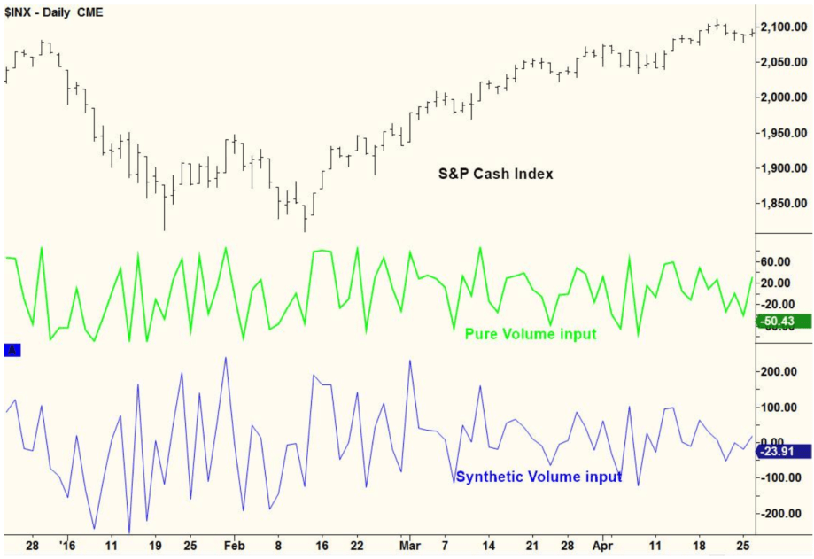
In all these 27 years, not one decimal point has been changed from my original algorithms. Every indicator we have is derived from one of these two input streams. The picture below illustrates the way Divergence Analysis’ indicators are leading rather than lagging.
At the top of the graph is the S&P 500 Cash Index, and below it two lines represent input data over the same exact time period. The green line is the input of pure raw volume data, and the blue line is the input of our synthetic volume data.
You can see that both of these lines would be hard to correlate with the actual price data. The pure raw volume data is what we used in the early days to trade and analyze the S&P and other big market indices. The synthetic volume data is what we developed around 2004, so we could use this same methodology (we call moneyflow) to other markets where raw volume data was unavailable. Now we could apply our systematic indicator approach to all markets such as bonds, currencies, individual stocks, options, futures, and commodities.

Notice the high correlation (patterns) between the raw volume and synthetic volume lines. This proved that our new synthetic volume was a valid representation of raw volume. In short, from 2004 until the present day we built all of our models to be “visually adaptive” for the trader to use, efficiently trading any asset in any time frame.
We are excited to make these tools available to all Optuma users for free for a limited time. When you log in to Optuma you will see a new tools folder called DVAN which contains six indicators, including the DVAN SmartLines.
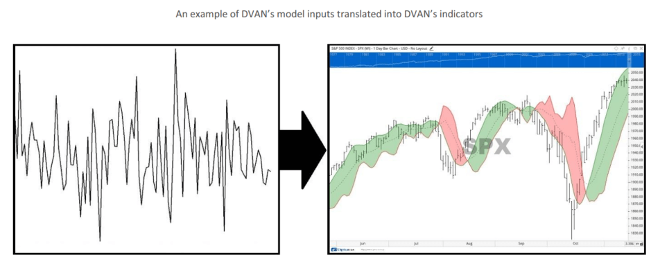
As mentioned above, the DVAN methodology measures underlying moneyflows, rather than price action, to determine a security’s strength and direction. The moneyflow algorithms derive a security’s force from mass and acceleration inputs (F=MA.) DVAN calculates mass with underlying volume and acceleration with velocity and momentum. This proprietary process inputs chaotic market data and translates that data into the DVAN indicators for a clear understanding of the market environment.

Our aim is to simplify the trading process and create a visual display of the market or individual security—providing clear decision points for trading, analysis, and investment strategy.
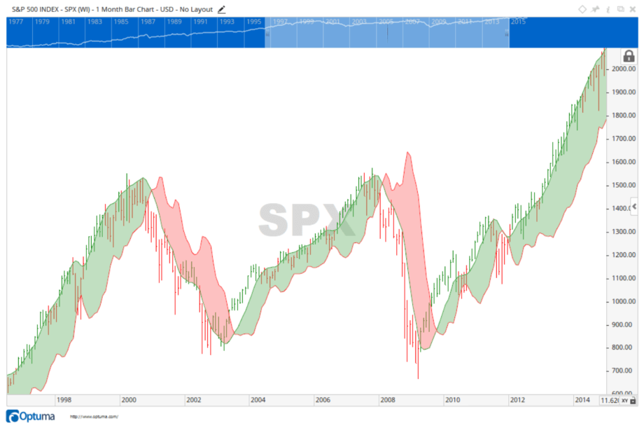
The DVAN SmartLines indicator shows color-shaded buy and sell cycles that overlay prices on the chart—equipping the user with a roadmap for direction and force. The changes between buyer dominance and seller dominance can be seen by the shift from red to green price bars, meaning buyers are taking over from sellers, at bottoms, and conversely the shift from green to red at tops. These shifts can easily be seen within the boundaries of the SmartLines buy and sell cycles. When the SmartLines converge, they signal entry into a buy or sell cycle which confirms the shift of dominance between buyers and sellers.

The major cycles above clearly show the transitions from bull market to bear market in January 2001, and the subsequent bull market beginning in early 2003. The cycles also identify the more recent bear market that began in January 2008, until buyers stepped in, in March 2009. And to further illustrate the leading attributes of the DVAN methodology, notice the red price bars [sellers dominant] at the very tops in 2000, and the 5 months of green price bars [buyers dominant] leading into the major bottom in 2003. Also notice the red price bars again leading into the top in 2007- 2008, and the green price bars leading from the bottom in 2009.
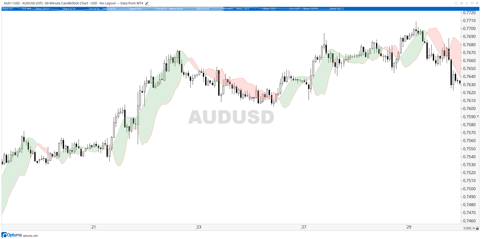
The DVAN methodology helps to mitigate risk by providing visibility and control to the user. Volatile input is translated into decision-useful information, and buy and sell cycles are made visible through the SmartLines. Additionally, the DVAN indicators are not specifically engineered for any one asset and can be applied to virtually any liquid security, over any time frame. For example, here’s a 30 minute currency chart:

We encourage you to take a look at these tools in Optuma to help you achieve better trading results. If you have any questions about using these tools please contact us at info@divergenceanalysis.com.
Get blog updates and Optuma News
