Scripting Guide for Relative Rotation Graphs®
How to use our powerful scripting language with Relative Rotation Graphs® to help identify opportunities.
As you have seen in other articles and blogs, Relative Rotation Graphs® (RRGs) are a great tool to determine relative strength of a basket of stocks or currencies against a benchmark, but one question we often get is 'can RRGs be used for asset allocation purposes?' The answer is YES!
As you have seen in other articles and blogs, Relative Rotation Graphs® (RRGs) are a great tool to determine relative strength of a basket of stocks or currencies against a benchmark, but one question we often get is “can RRGs be used for asset allocation purposes?” The answer is YES!
In this example we have created a weekly RRG with six US asset classes, using the following ETFs:
We need to use a balanced benchmark as the comparative index, such as the Vanguard Balanced Index Fund (VBINX from Optuma’s US Funds database) which tracks the performance of a portfolio consisting of 60% US equities, and 40% US bonds (broad market-cap weighted).
Here’s a weekly RRG for the year, with the tail length set to 12 weeks:
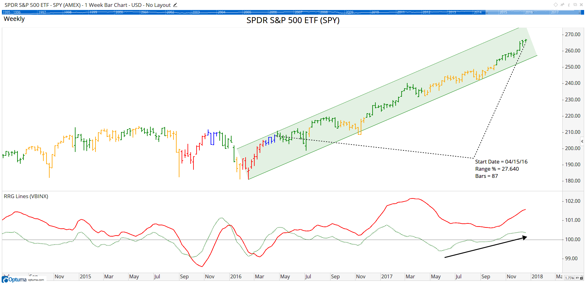
What is noticeable straight away is that the US Equities (SPY) has remained on the right side of the chart (i.e. in a relative uptrend against the benchmark) for the entire year. In fact, it re-entered the Leading quadrant from Weakening, and continues to move further away from the benchmark with increasing momentum and strength.
By changing the colour scheme on the weekly chart to RRG Quadrant Bars and setting the benchmark for these RRG Quadrant bars to VBINX, it’s easy to see which quadrant it is in for that week. The Time Price Measure tool tells us it’s been 87 weeks since equities were lagging (red bars) or improving (blue), during which time the price has increased by over a quarter.
 SPY
SPY
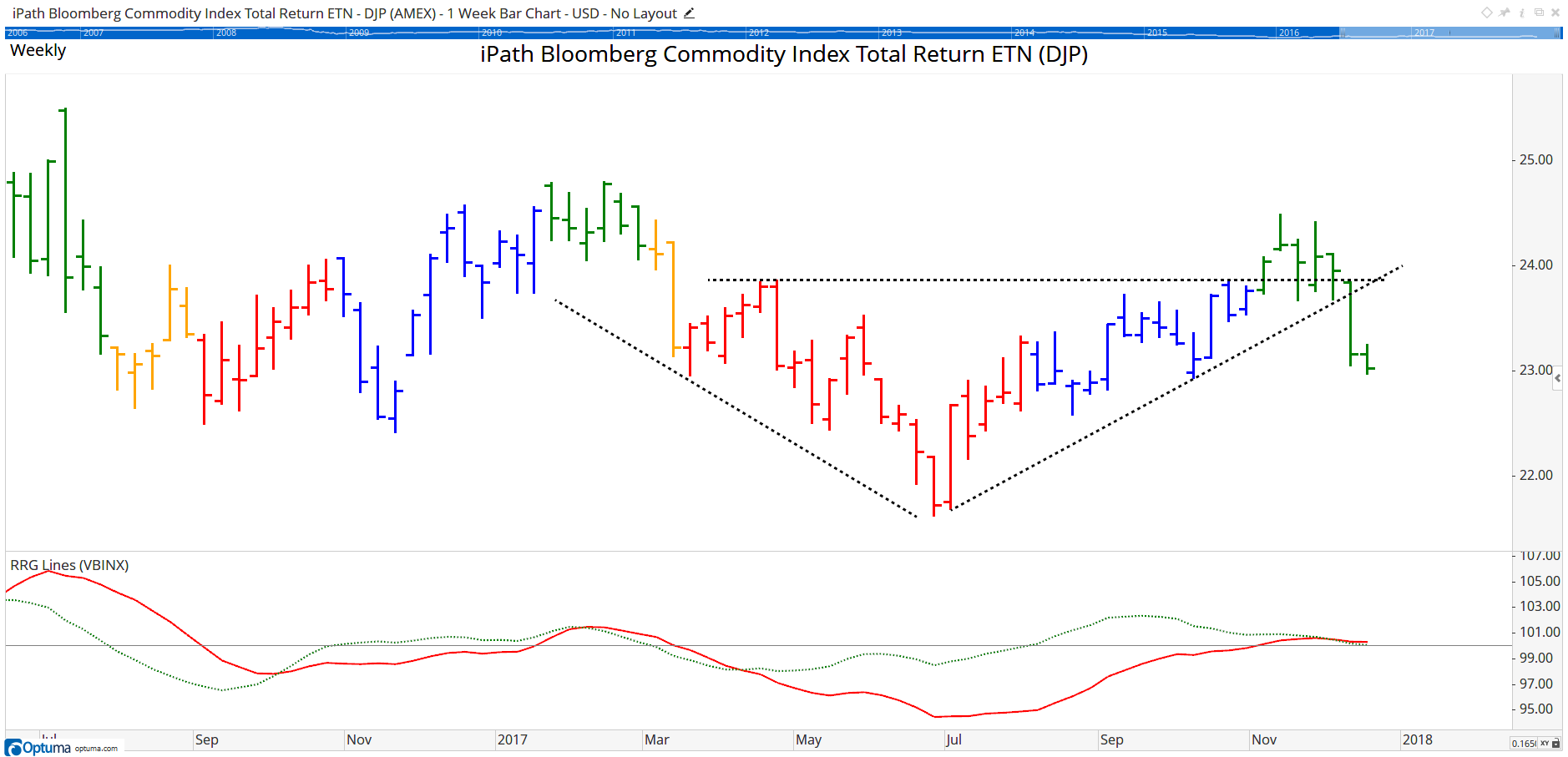
Commodities - as represented by the iPath Bloomberg Commodity Index Total Return ETN (DJP) - is the only other sector in the Leading quadrant, but weakness over the last few weeks (particularly in gold) has seen it head south towards Weakening. When looking at the weekly bar chart you see the break of resistance around $24 could not be maintained, and last week saw the rising trendline in place since July get breached - obviously not a positive sign!
 DJP
DJP
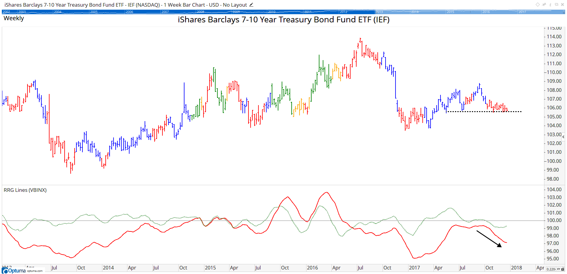
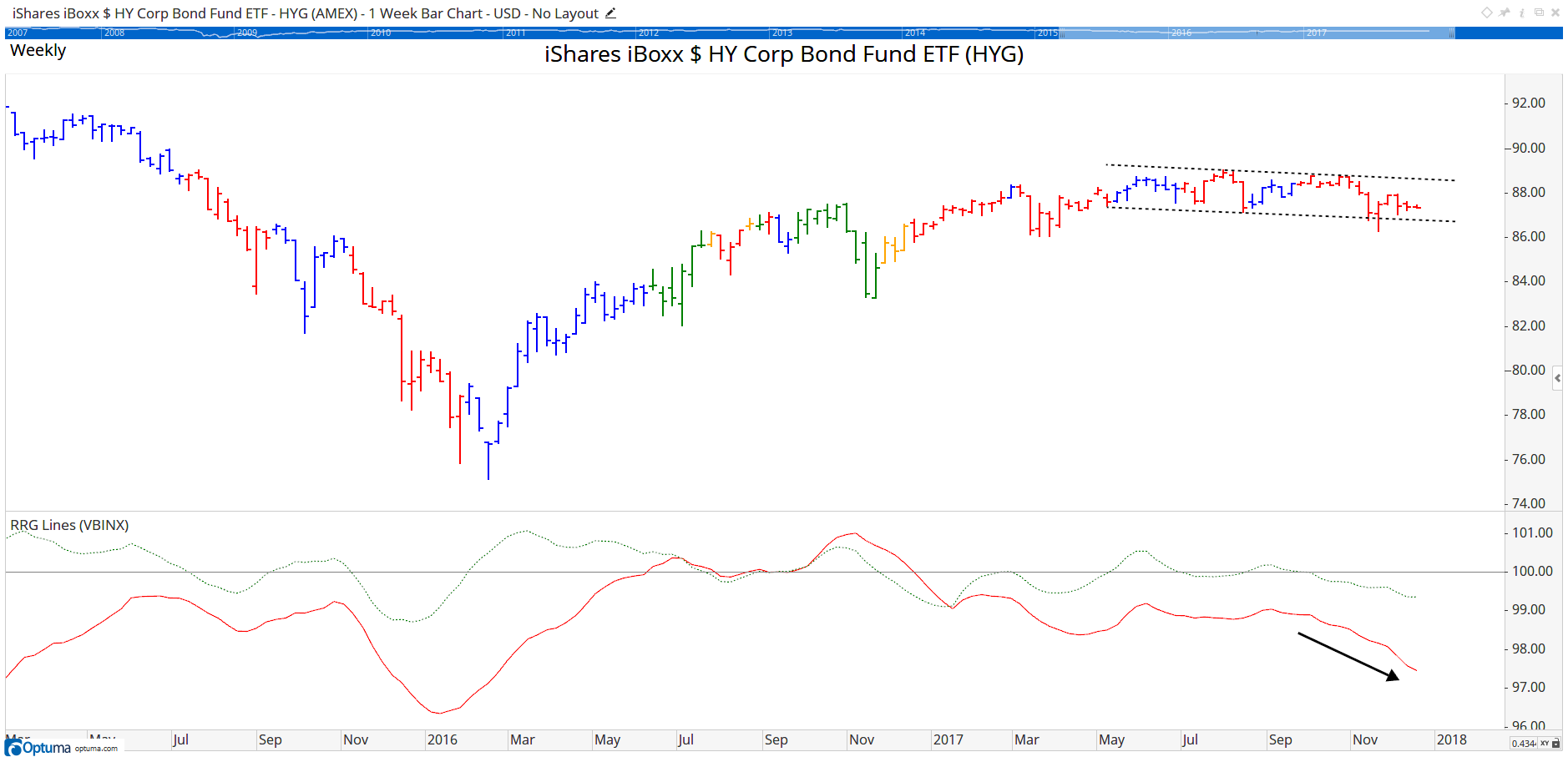
The other asset classes in the chart (bonds and real estate) have all been in relative downtrends vis-à-vis the benchmark since October, with government bonds (IEF) being the weakest as it has moved furthest from the center of the chart. Having said that, there was an up-tick in JdK RS-Momentum this week as it finds support around $105.60, but given the fact that JdK RS-Ratio is still sloping slightly down (ie moving West on the RRG chart) and that the JdK RS-Ratio reading is the lowest in this universe continue to make it an asset class to approach with caution - just like HYG and LQD which also continue to head lower on the RS-Ratio scale.
 IEF
IEF
 HYG
HYG
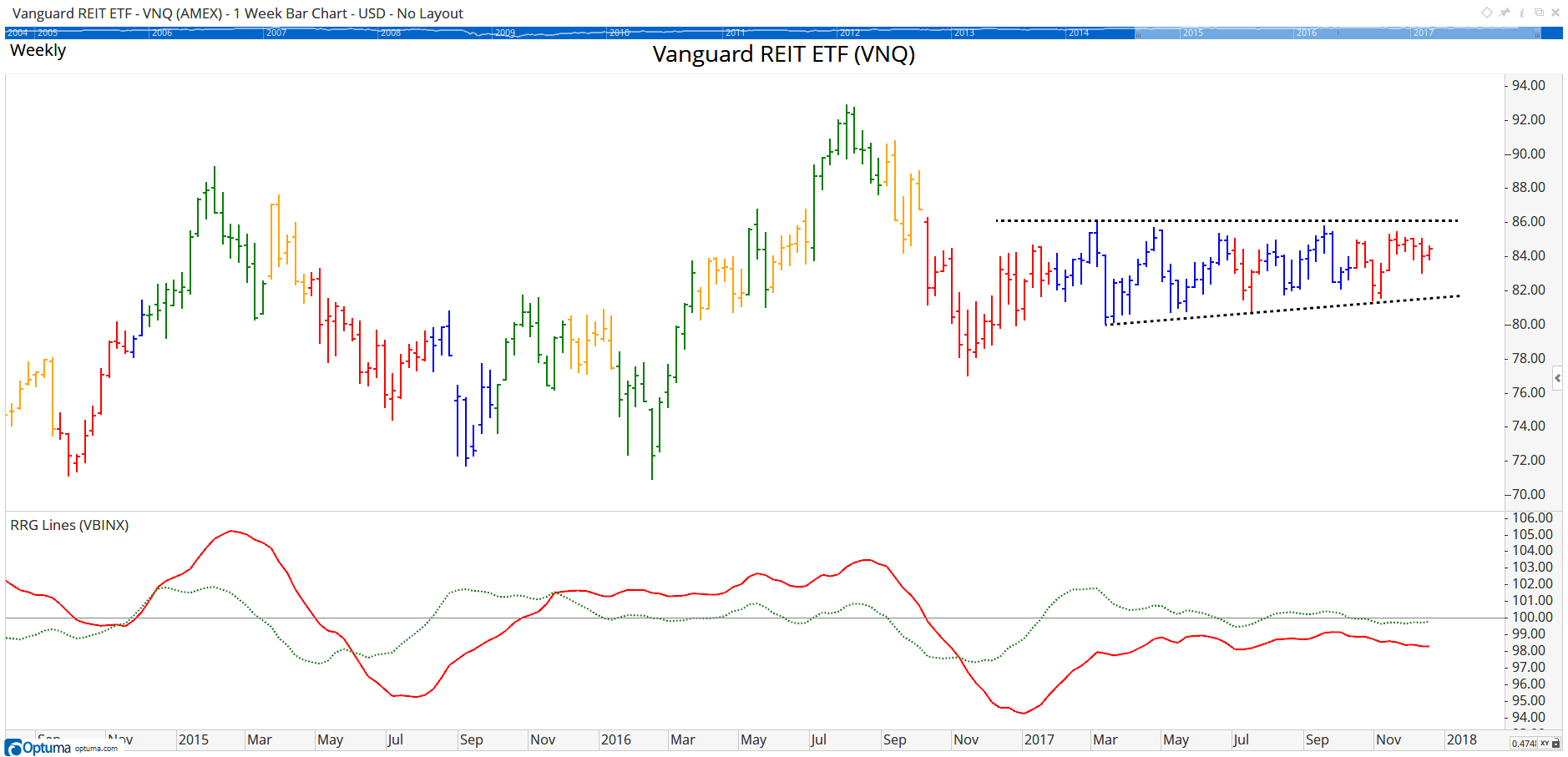
Real Estate (VNQ) has been moving sideways all year, jumping between Lagging and Improving as seen in the bar colours, but never managing to break the strong resistance at $86. A downward break of that horizontal support level will very likely cause an acceleration down in both the price and relative graphs.
 VNQ
VNQ
In summary, clearly equities is the asset class that needs to be overweight in a balanced portfolio until we see evidence to the contrary, such as a reversal on the RRG or a series of lower highs and lower lows.
For more information on using RRGs in Optuma see Mathew Verdouw’s webinar recording here.
Get blog updates and Optuma News
