Catching a Falling Knife
So far in this series, we’ve been looking at long term general market conditions with an overall bullish se...
Last week I wrote about the journey I took with the Dynamic Market Profile tool and how it showed some promise as a mean reverting strategy. I performed a number of “back tests” (getting the computer to run the simulation with a model portfolio), but could never get the consistent results I was seeing by observing charts.
Last week I wrote about the journey I took with the Dynamic Market Profile tool and how it showed some promise as a mean reverting strategy. I performed a number of “back tests” (getting the computer to run the simulation with a model portfolio), but could never get the consistent results I was seeing by observing charts. I found there was a real problem in the way many analysts, including myself, use back testing. The main issue being that traditional back tests combine signal testing and portfolio testing – that’s too many independent variables tested at one time. I’ll write on that in more detail another time. I solved the issue by building a Signal Tester into Optuma, and that led to the Optex Bands breakthrough.
At the start of 2016, Carson Dahlberg, CMT, joined us in our USA office as our Chief Market Strategist. Carson has one of the most disciplined quantitative approaches to the market that I have ever seen. His input has really helped us, and our clients, a lot. As we were preparing for the Optuma release, we were searching for a “killer” indicator to include with Optuma that would really help our clients. There are a number of tools that came out of our search, like “Volatility Swings”, which I’ll write about another time. Trying to come up with new indicators is a lot like panning for gold – it takes a lot of testing before you find something of value. Often you discover specks of hope, and occasionally you find a valuable gem.
Through this process Carson took some time to re-examine my work on Dynamic Market Profile. He found some interesting results when we created a ratio line which measured the distance of price from the Point of Control (POC). If you remember from the last post, the further price gets from the POC, the higher the probability that it will return. So the ratio allows us to measure the excursions from the POC. We also added a volatility measure into the calculation so we would have a consistent scale from one security to the next.
Here is what we found:
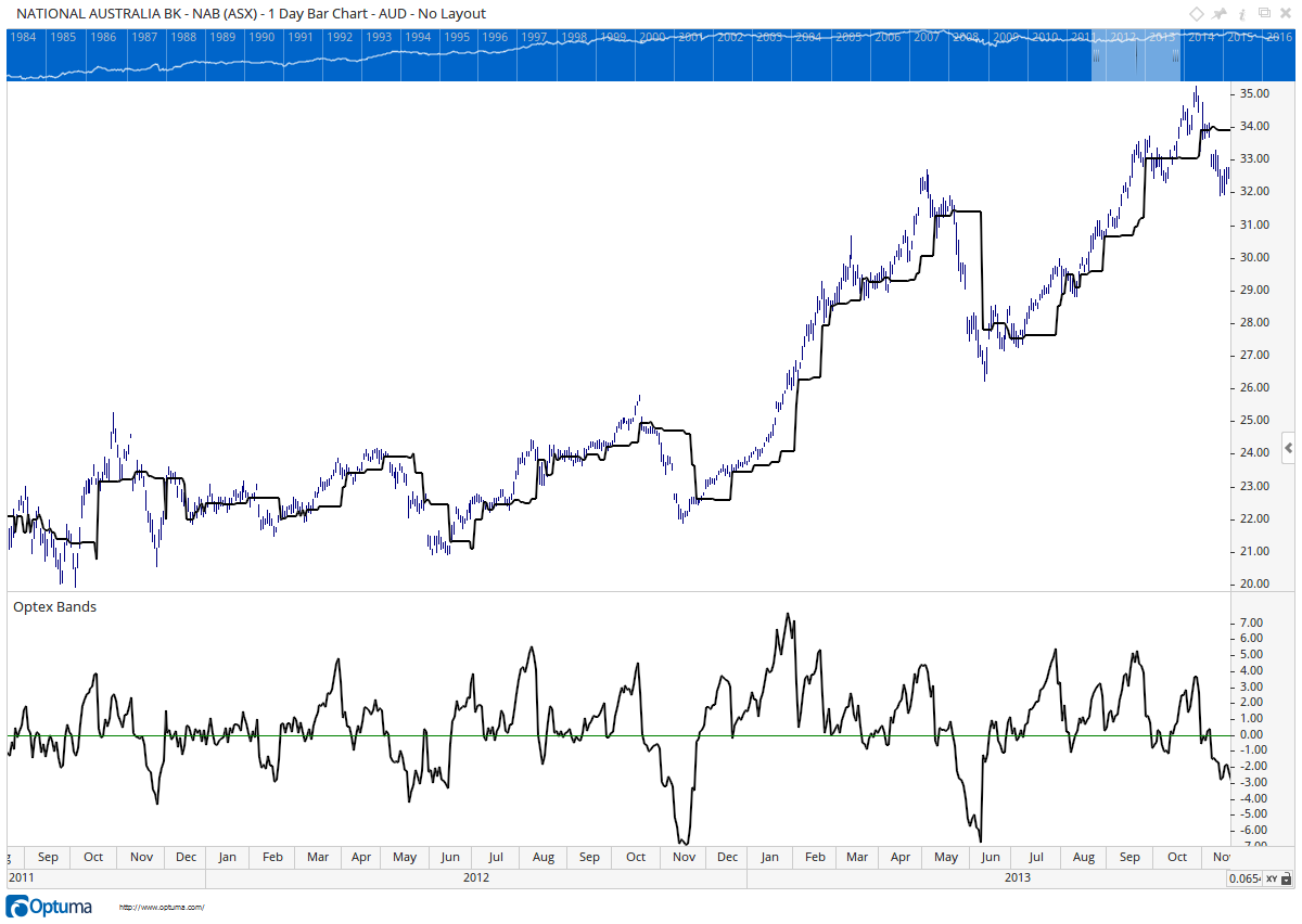 NAB Optex Ratio
The ratio is the line on the bottom of the chart. I’ve left the POC on the chart so you can see how the ratio reacts as the price gets further away from the POC. Remember that we also baked in a volatility calculation, so we measure the excursion in units of volatility.
This was exciting! There was a high correlation between the ratio falling to extreme levels and the market making a significant bottom. We played with some fixed levels, similar to the 30/70 commonly used on RSIs, but the ratio did not always fall to the same level. In the end I noticed this was similar to the measurement we were trying to solve with the Dynamic Market Profile, so we added another Dynamic Market Profile to the ratio line. We went on to play with the Standard Deviation ratios to tune it, and it we ended up with the adaptive bands that we could use as quantitative signals.
Here is a look at that same chart with the bands showing:
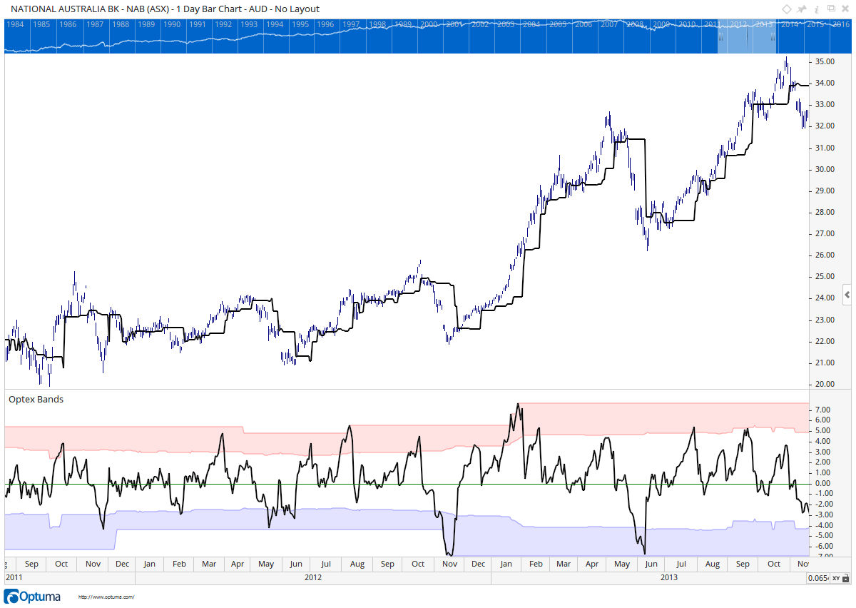 NAB Optex bands
Note how the bands adapt. When the ratio turns in the bottom zone, it’s a great measure that the market is heavily oversold and primed for a rebound to the POC. With the adaptive bands we had a lot of points that we could test with in the Optuma Signal Tester. There are a few things we noticed with this:
This became our Optex Bands tool. “Optex” is a diminution of “Optuma Extremes”. Now we needed to get to the job of testing the indicator to see if our observations held across the market.
The first thing we needed to do was define the condition as a script. Here is the one that showed promise:
o1=OPTEX();
cond1 = o1.Ratio < o1.25Lower;
cond2 = o1.Ratio TurnsUp;
cond1 and cond2`
Here we are storing all the results from the Optex function into a variable “o1”. We then set the conditions. The first is that the Ratio line needs to be in our blue zone. The second is that the Ratio line needs to turns up. The final line is telling Optuma which conditions need to be true to show the line on the chart.
I use the “Show Bar” tool set to “Lines” in Optuma to display when these conditions are met.
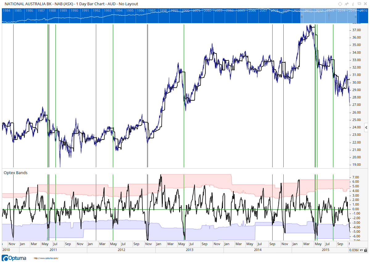 NAB Optex bands
You can see the that there is a high correlation between the turns in the ratio and some really good times to get into this market. Now I needed to take this and test it over a larger set of securities.
Earlier I was mentioning that we built a new Signal Tester in Optuma. The main point is that I wanted to test the efficacy of a technical signal without the portfolio bias that is usually introduced in traditional back testing. When we observe something that looks good on a chart, we need to test it further to see if it is really as good as we think. In particular, we need to be sure that our strategy will not destroy our portfolio in a bear market.
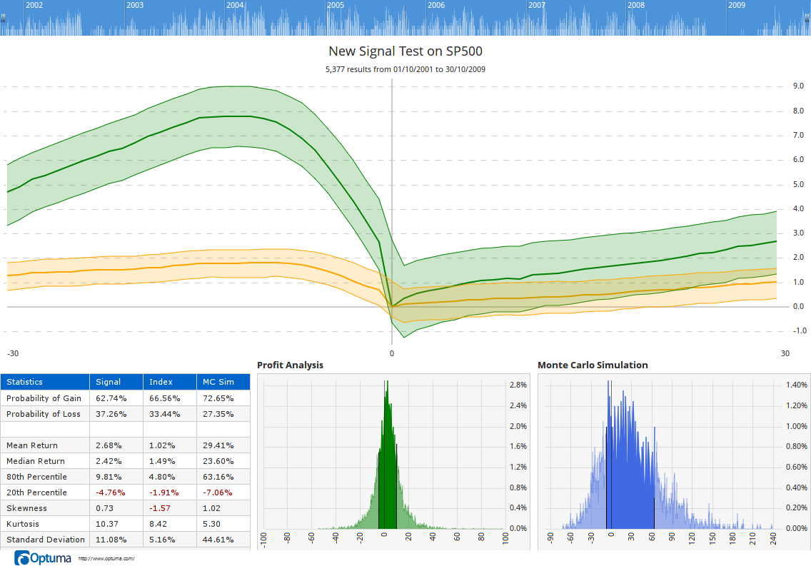
After lots of testing, we found that the best results were when the market was in an uptrend and the Ratio line entered the blue band. The following image is from the Optuma Signal Tester. We tested from October 2001 to October 2009 on the SP500. We chose that period because the S&P index finished at the same price that it started. That is, it was a “flat” market. The Signal Tester takes every signal that occurs in that period (there were 5,377 of them), and measures the returns of the security 30 days before and 30 days after the signal.
Here are the results of the test. Can you believe that this test on all of the S&P 500 equities takes only 38 seconds?
 NAB Optex bands
The green band is the most important. It shows the average performance of the equities before and after the signal. Since this is an indicator showing extreme oversold conditions in the market, it’s not surprising that the green band is falling into Day 0 (the vertical line on the chart). We can see that on average our return one month after this signal is 2.68%. That’s 22.5% annual return – not too shabby!
If you remember from my last post, a lot of information can be hidden inside an average, and we have to dig in to find out what values make up that average. That’s why we have the “Profit Analysis” plot on the chart above. It’s the green distribution plot. What I want to see here is that it’s skewed to the right (making money) and is high and tight. That tells me that a lot of the results are significantly close to the stated average and I can have a lot of confidence in it. If it was low and wide, then I know that my average is not statistically significant at all.
When I look at the stats, it tells me that there is a 63% probability that I am going to get a positive return when I take this signal. What’s more, when I string 10 random signals together (tested 20,000 times in the Monte-Carlo simulation), my probability of being profitable rises to 73%. Look at the blue distribution and the final column of the stats table.
All of Technical Analysis is rooted in probabilities, even if it is by observation. For example, when we see the market find support and resistance at a ratio repetitively, we expect that ratio will be significant in the future. Remember that we call them “indicators” not “certainties”. In the markets nothing is a certainty, but we can put the probabilities in our favour and manage the reality as it unfolds.
More on the Signal Tester another time. It was such an important component in the building of the Optex Bands that I needed to cover the basics here. We discovered that the excursions of the Optex Ratio line into the blue oversold zone was indeed statistically significant.
If you currently use or are trialling Optuma, and have an active Subscription, you can try the Optex Bands tool for yourself. Let us know what you think.
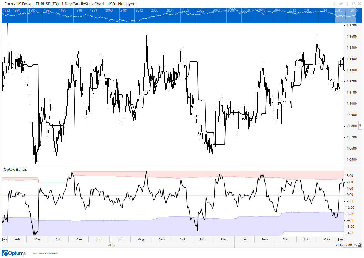
What about FX? Here is a chart of the Euro US Dollar. Notice how in this chart both sets of zones are significant.
 NAB Optex bands
The reason for this is that the Optex Bands Ratio measures the distance from the POC. If the price slowly climbs, as it usually does in equities, then the POC is always following and there are no extreme moves to the upside. With equities the moves down tend to be more aggressive (everyone getting out at the same time) leading to the big excursions and the oversold signals. When we look at currencies, they don’t have the same slow buy, rapid sell trait. They are more balanced which leads to signals on both sides.
Whew! There is a lot to take in here. We’re really excited about the Optex Bands and hope you are able to benefit from them. Remember to be very careful how you layer new strategies into your work-flow. We’re a company that is continually experimenting with new ideas and we believe there are many new Technical Analysis techniques waiting to be discovered. Make sure you are subscribed to our blog so you you can stay up to date with the new work we are doing.
Get blog updates and Optuma News
