Catching a Falling Knife
So far in this series, we’ve been looking at long term general market conditions with an overall bullish se...
Optex Bands is a new tool we created to measure potential extremes away from the “consensus” price. To explain the how and why of Optex Bands, we have to first take a journey through the evolution of this tool. In this post, we cover Market Profiles and POC's.
Optex Bands is a new tool we created to measure potential extremes away from the “consensus” price. To explain the how and why of Optex Bands, we have to first take a journey through the evolution of this tool. Along the way, you will learn why they are a powerful measure of overbought and oversold markets.
In 1998 I was at an ATAA presentation in Canberra, listening to Ray Barros present on Market Profile. Ray explained when price gets out to the 3rd Standard Deviation, there is a higher probability for it to return to the point of control. Whenever we look for these opportunities, we call it a “Mean Reversion Strategy”. We’re expecting the price to revert back to the mean.
Whoa! That’s a lot of terminology. Let’s take this one step at a time. The first thing we need to do is explain the concept of Market Profile. It was developed by the late Peter Steidlmayer in 1985 as a way of visualising market structure as the bars develop through the day.
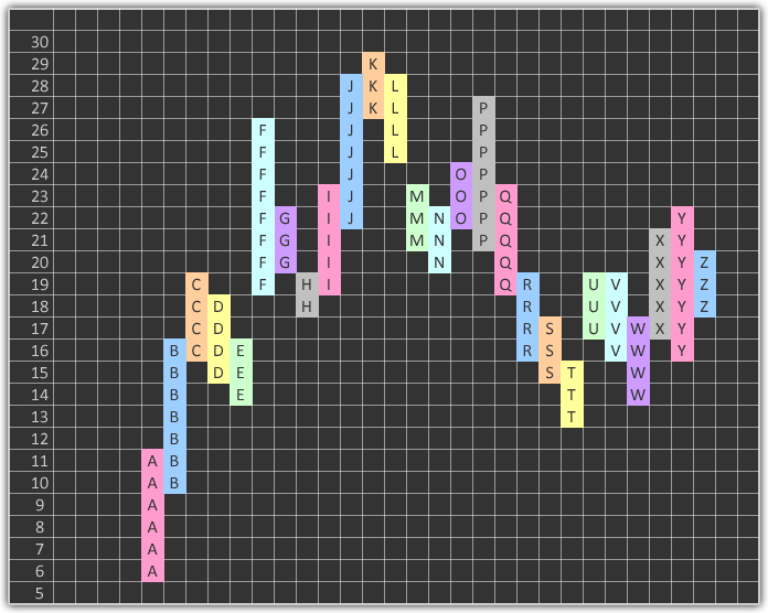
Take the image below. Steidlmayer divided the bars up into “units” and gave each bar its own letter. This is just like the “normal” bar or candle chart, except that we display each bar using these units.
 Profile Construction
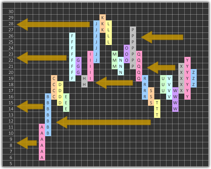
He then compressed all the bars and allowed them to stack up, but not overlap. Much like the old game of Tetris (for those of us who remember).
 Profile Construction
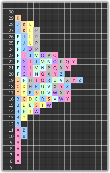
The result was the following. You can see each bar has been pushed to the left and the bars allowed to be split up. Steidlmayer wanted to know how much time the security spent at a particular price. The rationale was that the price where the volume was highest would act like a magnet, because it was the most agreed upon price. Said another way, if price moved too far away, and no more buyers or sellers were found, price would drift back to find more buyers and sellers.
In this case, you can see row 19 has the most blocks in it. Steidlmayer called this “The Point of Control” - it’s where the volume is the highest.
 Completed Profile
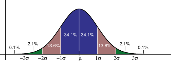
Steidlmayer noticed that the profile resembled a traditional Gaussian Distribution.
 Gaussian Distribution
For those unfamiliar with Statistics, the x-axis contains values that we are observing, and the y-axis is the percentage of time that value occurred.
This is easiest when we think of something we can identify with, like average heights of men and women. There are going to be a lot of people around the middle (average height), some very tall people and some very short. Have a look at the following chart:
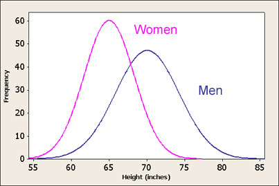 Height Distribution
There’s a lot to be seen from this. Men are on average taller than women. The fact that the Frequency (y-axis) is higher for women tells us there is less variation in the heights of women than in men. We also see that the tallest men are around ten inches taller than the tallest women. These plots are very important for describing observations, and that is exactly what Steidlmayer thought. Too often we are caught looking at an average, forgetting to examine all the numbers that went into that average.
In our first distribution above, you’ll notice there are three coloured zones on each side of the average. These are the demarcation points for the First and Second Standard Deviation. Don’t let the terms scare you. Standard Deviation is just the way we quantify the variance around the mean (average). This is best described with an example.
Let’s take two lots of three numbers:
| Values | 0, 50, 100 | 45, 50, 55 |
|---|---|---|
| Average | 50 | 50 |
| Variance | 33.333 | 3.333 |
The average for both is 50, but the variance (the measure of how scattered the values are around the middle) is very different for each.
Standard Deviations use squares and square roots. That’s beyond what I want to cover here, but at least you get the idea. It’s a derived measure of variance. When all the calculations are done, we find that 68.2% of all the observations are inside the first Standard Deviation. The next 26.2% cover the second Standard Deviation, with the remainder in the third.
Steidlmayer did this same process with the units in Market Profile. He would start at the Point of Control and count units on each side until he had counted enough units to reach the percentage for the first Standard Deviation. He’d continue on until he had all the Standard Deviations marked.
Here’s an example:
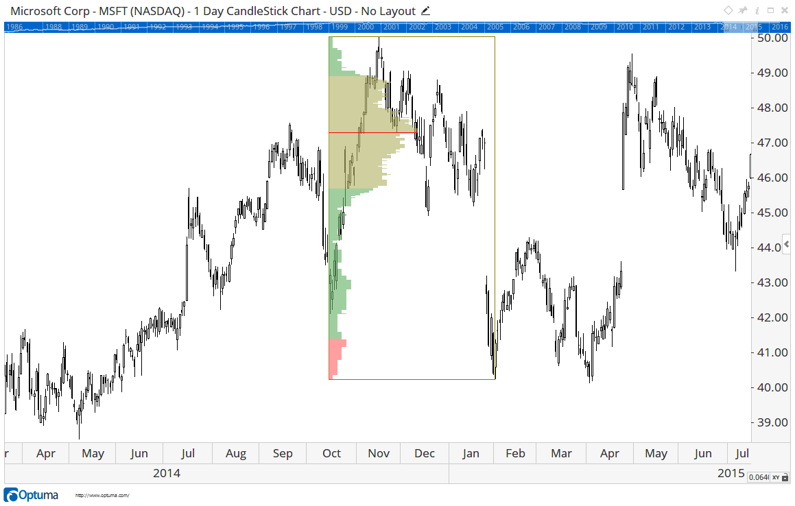 Market Profile on Microsoft
The box shows the candles that are being combined together to make the profile. The red horizontal line is the Point of Control. From that point we are counting the units to calculate the boundaries of the Standard Deviations. In this case we ran out of units on the top side and there is no third Standard Deviation Zone. This tells us that the “Profile” has a bullish skew.
If we project those boundaries forward, you can see how important they are and how the price keeps coming back to the Point of Control (POC).
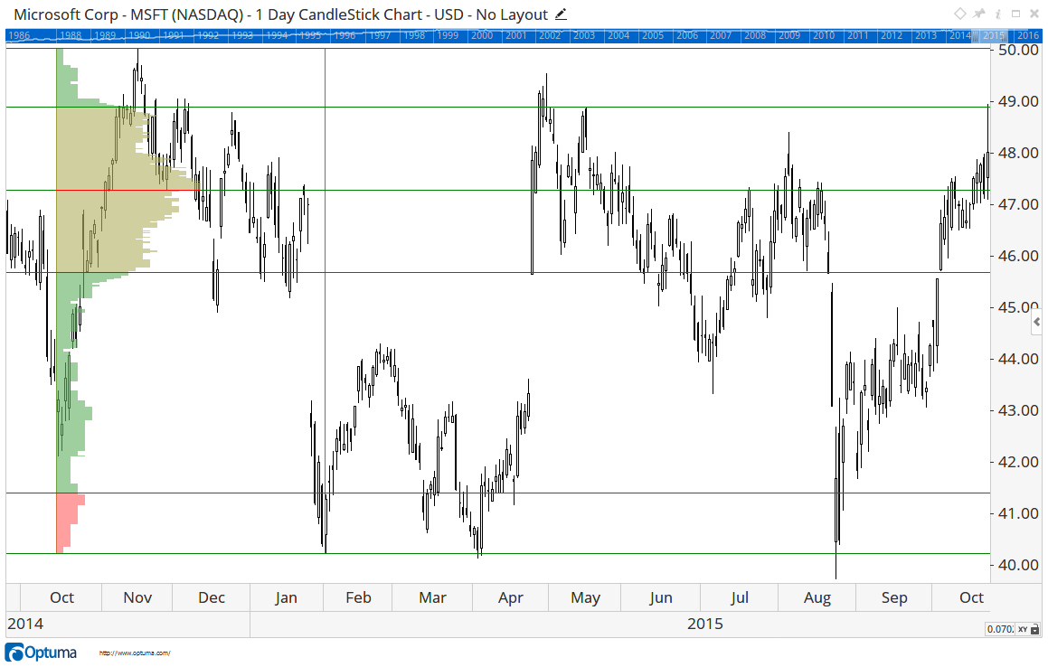 Market Profile on Microsoft with Zone Lines
This is the part of Ray Barros’ presentation that stuck with me for years and years. The POC was like a magnet. The further price got away from the POC, the higher the probability that it was going to revert back. The trouble is, as time goes by, the influence of the POC gets increasingly weaker. In fact, there’s always a new POC developing that we should be considering.
Ten years later I was working on the Bollinger Bands tool in Optuma (Market Analyst) and had an epiphany. While checking the Standard Deviation calculations, I remembered Market Profile. We should be able to create a Dynamic Market Profile tool that is more adaptive by using a similar band idea. Instead of standard deviations around a moving average, why not around the Point of Control?
So how does it work? Imagine that we take 20 bars and create a Market Profile calculating the POC and all the boundaries of the Standard Deviations. We then move the box by one bar and repeat the calculations. We continue to progress through our data bar by bar, calculating all the major points and joining those values together. Here is a chart of what that looks like:
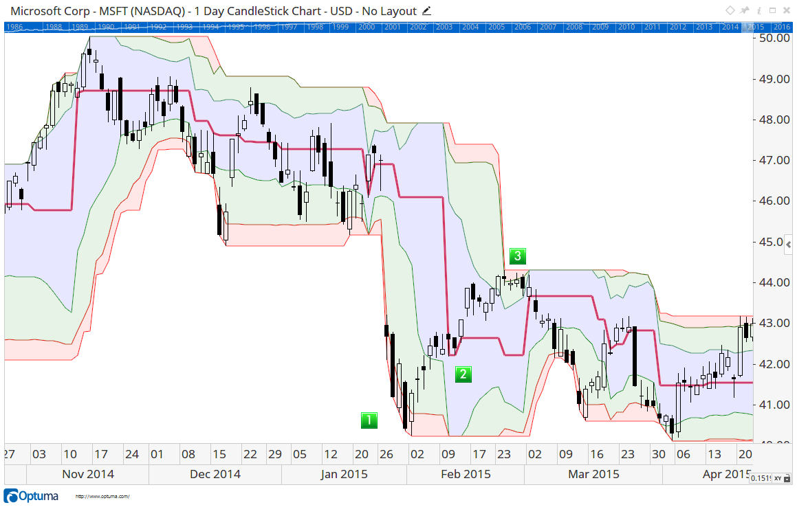 Dynamic Market Profile
I’ve made the POC line bold so you can see how it adapts to the market. The blue zone tells me the limits of the first Standard Deviation at any time. When price is in the blue zone, it’s within the consensus. Green is the second and the red is the third. Some things to note on the chart (look for the numbered green boxes):
This was a great breakthrough. It was useful for working with Mean Reversion Strategies, but my testing was just not giving the results I was expecting. Using traditional back-testing doesn’t help when we need to benchmark the efficacy of indicators. For that I had to wait another five years, get my CMT designation and learn a lot more about quantitative testing. More on that next time!
For where I was in 2008, the best use I could find was to apply an offset to the tool equal to the box size. I could see some really good opportunities to identify the trend and stay out of congestion at turning points. Here is an example:
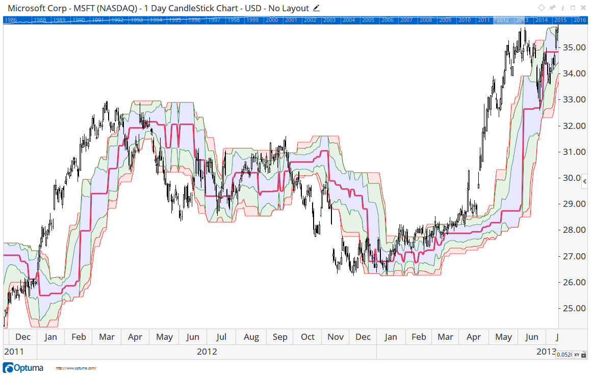 Dynamic Market Profile - Offset
Another observation is that the POC line is a great demarcation of trend. When the price is above the POC I can say the trend is up, and when below, the trend is down. Here is a chart with a 260 bar POC. In this one I have left the zones off. I do this with a “Show Plot” tool in Optuma and set the script to:
DMPA(BARS=260).PointOfControl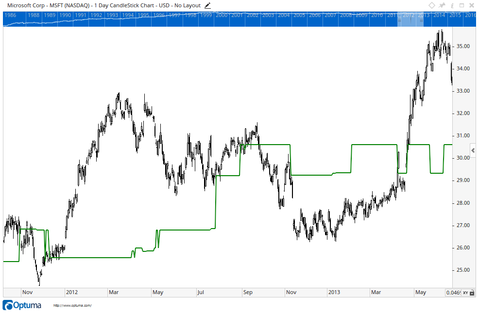 260 Bar Point of Control
You can see how an up-trending market is consistently above the Point of Control. If I wanted to filter on this I could write a script like this:
Close() > DMPA(BARS=260).PointOfControlThis would give us stocks in an up-trend.
I’ll leave you with this for now. The “Dynamic Market Profile” tool is in Optuma. It’s worth exploring. Next week I’ll explain how we went from this discovery to the creation of Optex Bands and the journey we have taken in piecing together ideas to create a powerful new indicator.
Continue reading at Optex Bands Part 2
Get blog updates and Optuma News
